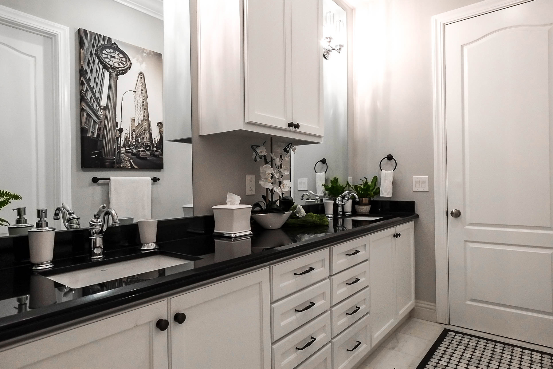
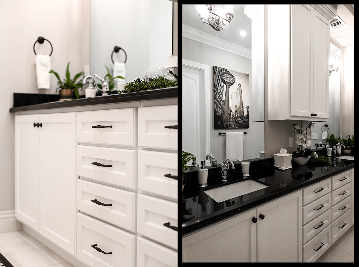
Finally sharing more progress shots from #JKIDCasaHacienda, my most favorited design project on social media! You guys have seen the kitchen that got MAJOR exposure from Instagram’s #1 home décor profile Inspire Me Home Décor (over 42,000 likes! Yikes!!!) Now check out all the other spaces that make this casa so special.
The Client
The clients are dear friends of mine with young toddler twins. They wanted the house to grow along with them so when we divided all the rooms up, we made sure to provide the twins with a Jack and Jill bathroom as their shared common space.
The Concept
What is a Jack and Jill bathroom you ask?
A Jack and Jill bathroom is named after the famous nursery rhyme. The concept is meant for 2 siblings to share an en-suite bathroom with their own private sleeping quarters. Privacy is ensured by having locks on both bedroom doors. This layout provides a functional shared space for multiple users without sacrificing valuable real estate to do so.
Materials and Finishes
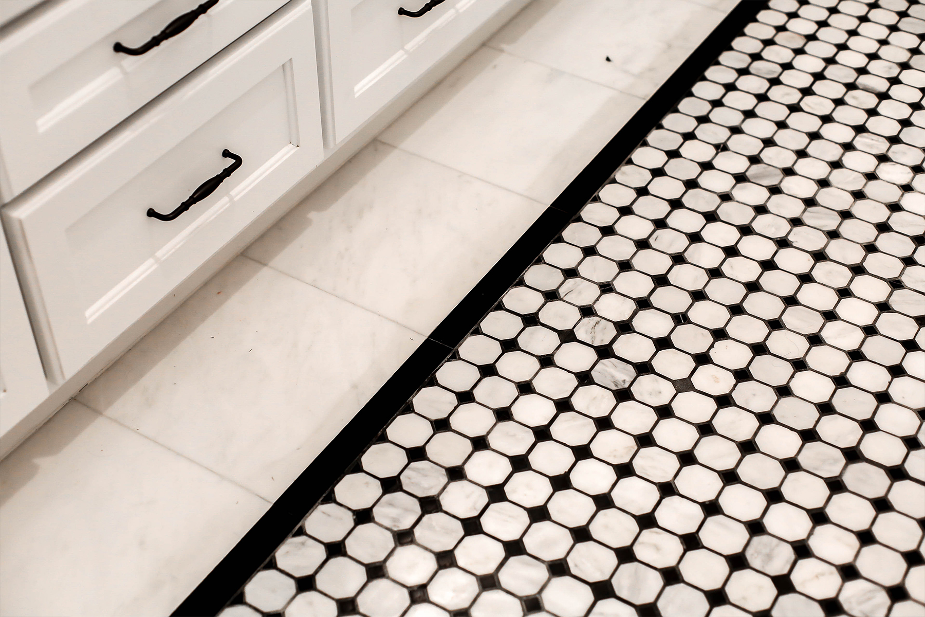
The color palette starts with a graphic black and white base using white marble and black granite to anchor the flooring. I created an inset floor runner using octagon marble and granite mosaic and wrapped that with the same white marble tile for the border. Do not install a graphic floor pattern wall to wall without some sort of border surround. Especially with a layout this busy,
The border helps to break the pattern up visually so it doesn’t overwhelm the space.
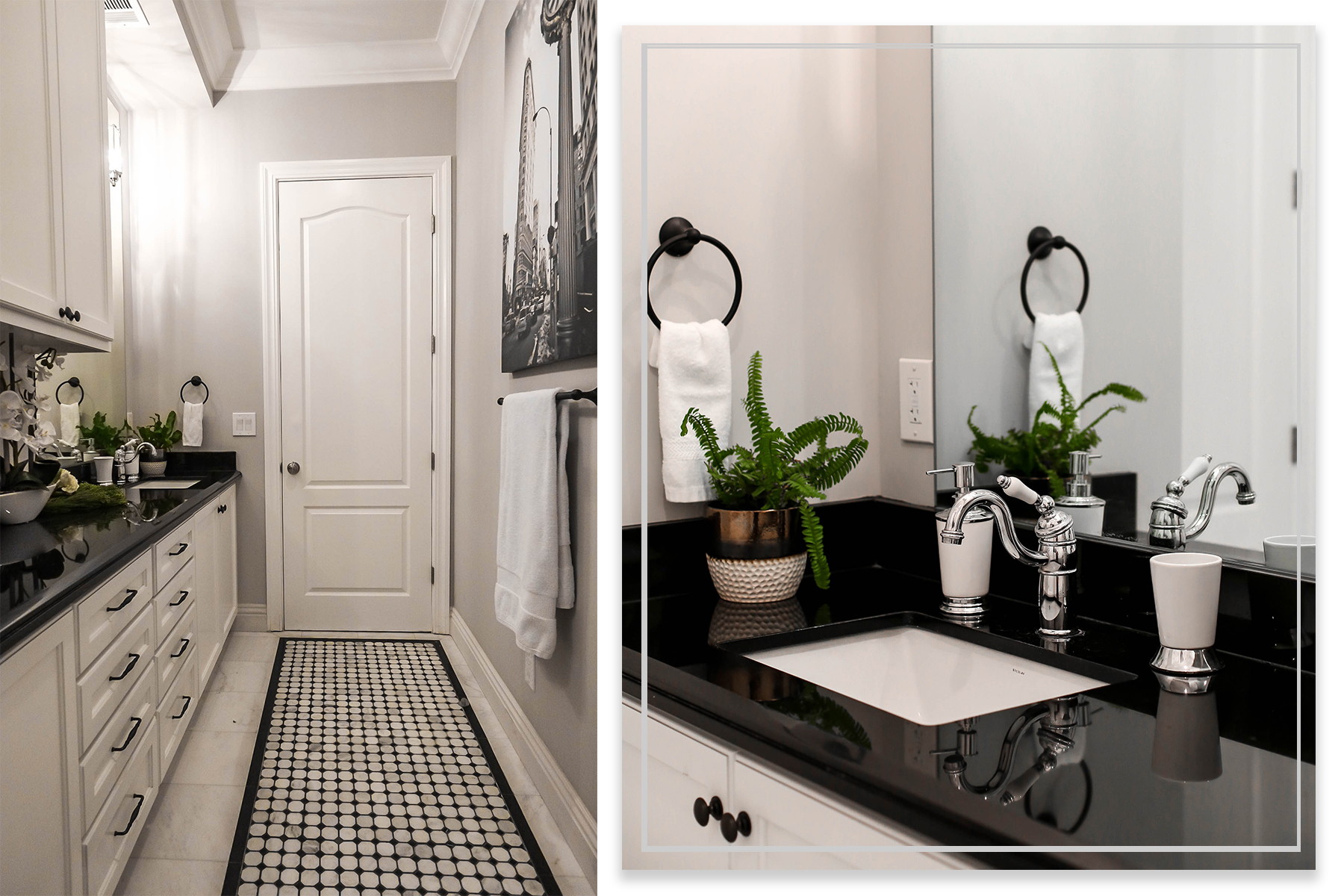
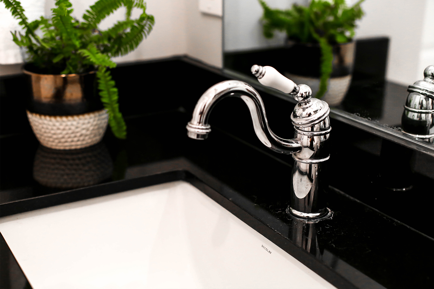
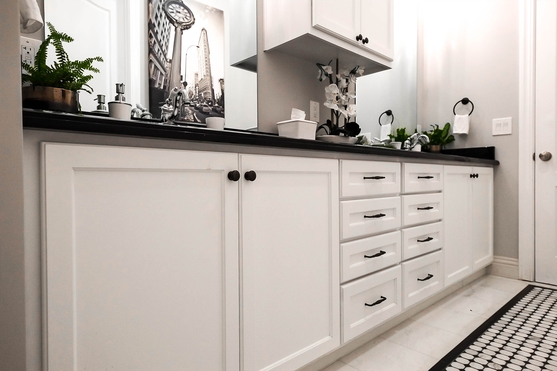
I wanted a clean and modern foundation to start layering color in as the kids get older. I love a high-contrast look so we kept the space minimal relying on reflective finishes like polished chrome faucets to add some dimension.
Art and Accessories
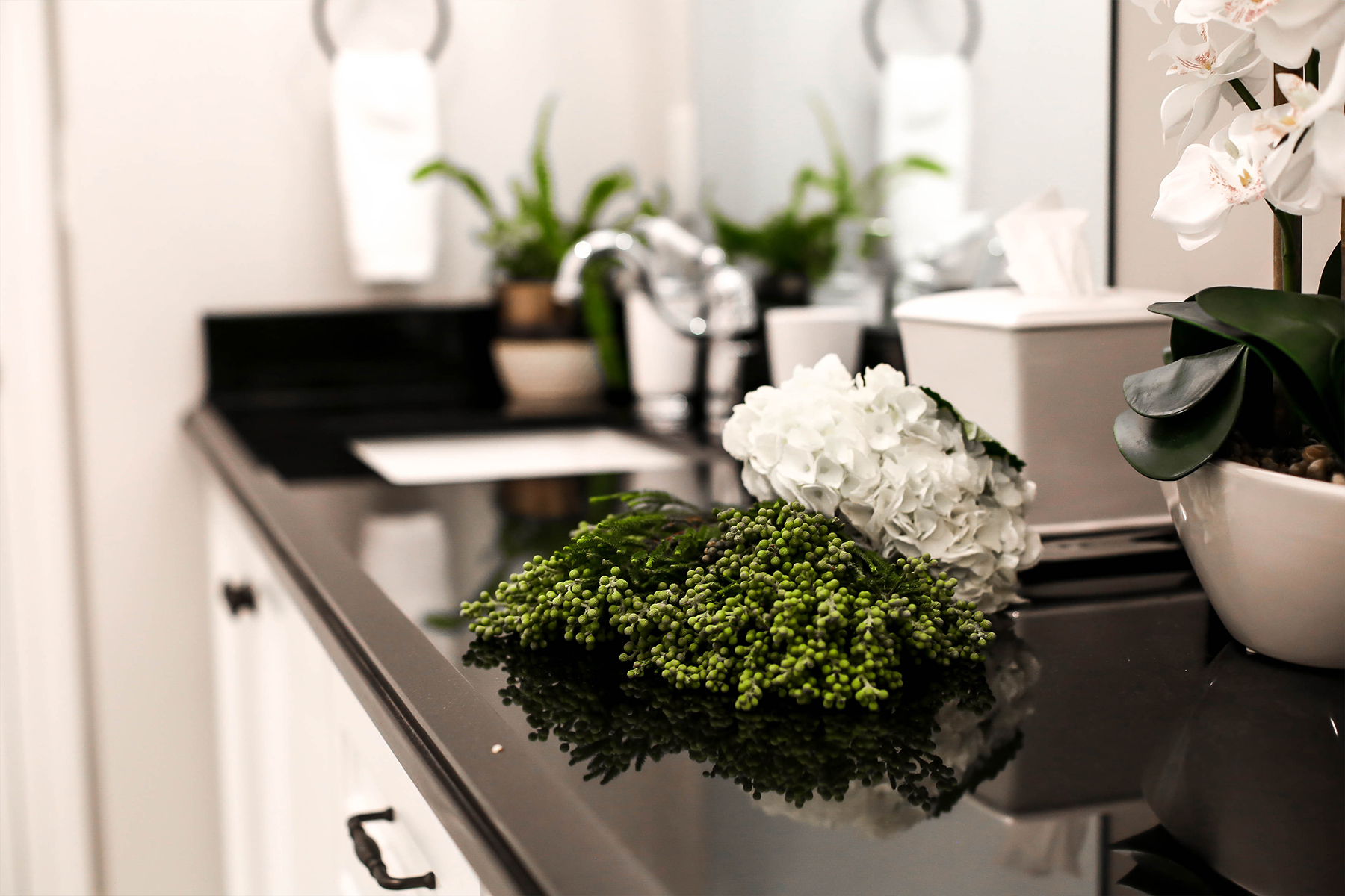
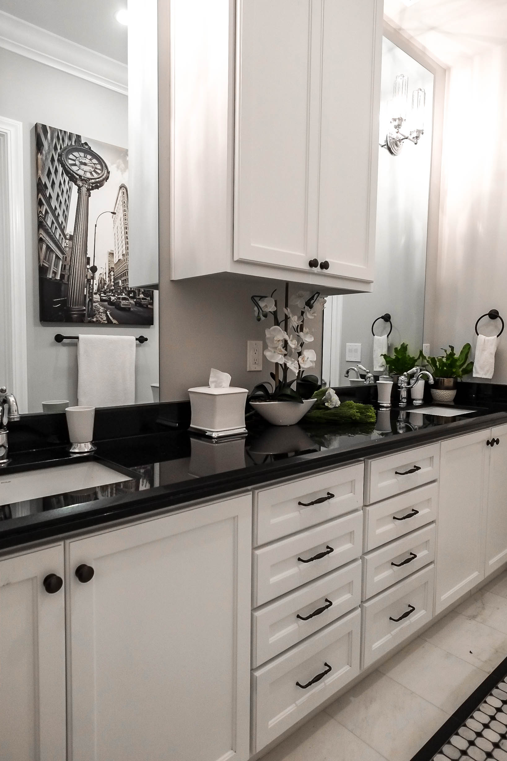
Mom is from New York so I found this incredible sepia-toned canvas of SoHo to remind the family of their roots. Every room needs a bit of fresh greenery so opt for silk and faux plants if the room lacks natural sunlight. In the future we can add colorful art and accessories and the bathroom would take on another look in an instant!
Designer’s Tip:
For those afraid of color, start with a neutral base. Here, I used black and white but you can easily swap out that pairing for greige and tan, grey and white, even desaturated tones of color can “act” as a neutral. You can add strategic color with your bathroom accessories such as towels, bath mats, and artwork. Once you tire of the look you can change it up without having to overhaul the entire space!
Closing thoughts
While graphic black and white might not work for everyone, it works for many. Especially when clients fear too much color or too bold of a statement, I ease them into the transition by starting with a clean base highlighting architectural elements with the finishes. The flooring pattern draws your eyes down while the large art piece draws your eyes up towards the high ceilings.
Every inch of the space has been conceptualized with growth and development in mind. What works for young toddlers now may not work for growing teens or young adults.
So before you embark on your next renovation, ask yourself this “Will I still love this look in 5 years? 10 years?” The more discerning questions you ask yourself NOW, the better your solutions will be for resolving potential doubts down the line.
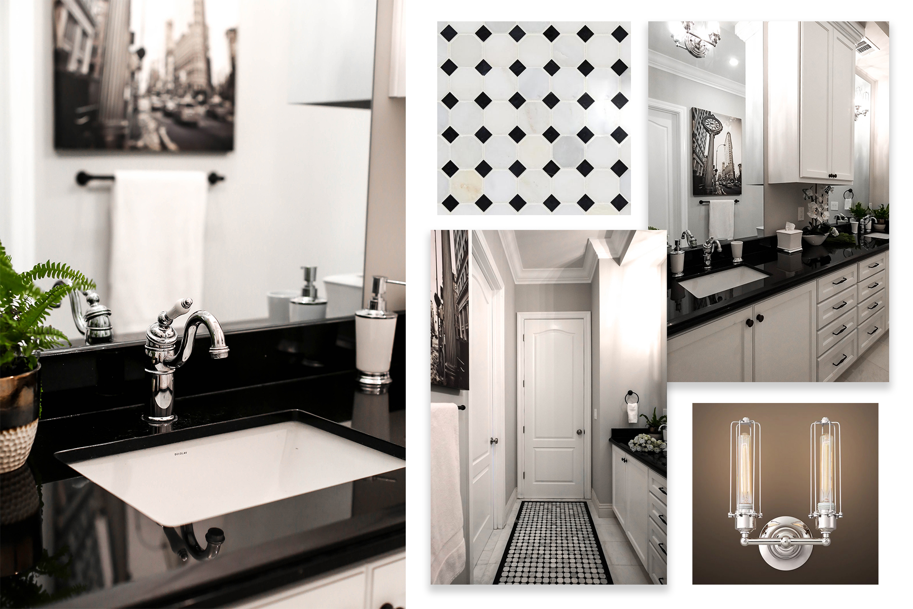
SHOP THE LOOK
Vanity Sconce | Faucet | Flooring pattern | Flooring border | Cabinet Hardware | Paint Color
What color(s) would you add to the space to mix it up?
Would love your thoughts! Comment below!

