Welcome to my latest interior design project: #JKID_LaCrescenta!
The Client
I absolutely LOVE designing for first-time home buyers. It gives me the opportunity to help dictate how they will use the home; especially if this is their first time graduating from a small condo to a single family residence, most clients have NO idea how to maximize every square inch of their space for optimal function and style. Which is where I come in.
June and Daniel found me when June was 5 months pregnant with their first child. You have heard that starting a family and buying a home (plus moving!) are a few of the MOST stressful times you will endure in life. Now imagine doing so while pregnant! Golly, I took one look at their situation and KNEW I had to lend a helping hand.
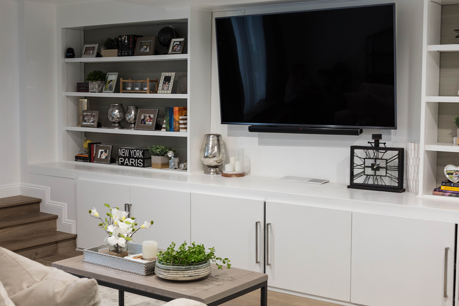
The Concept
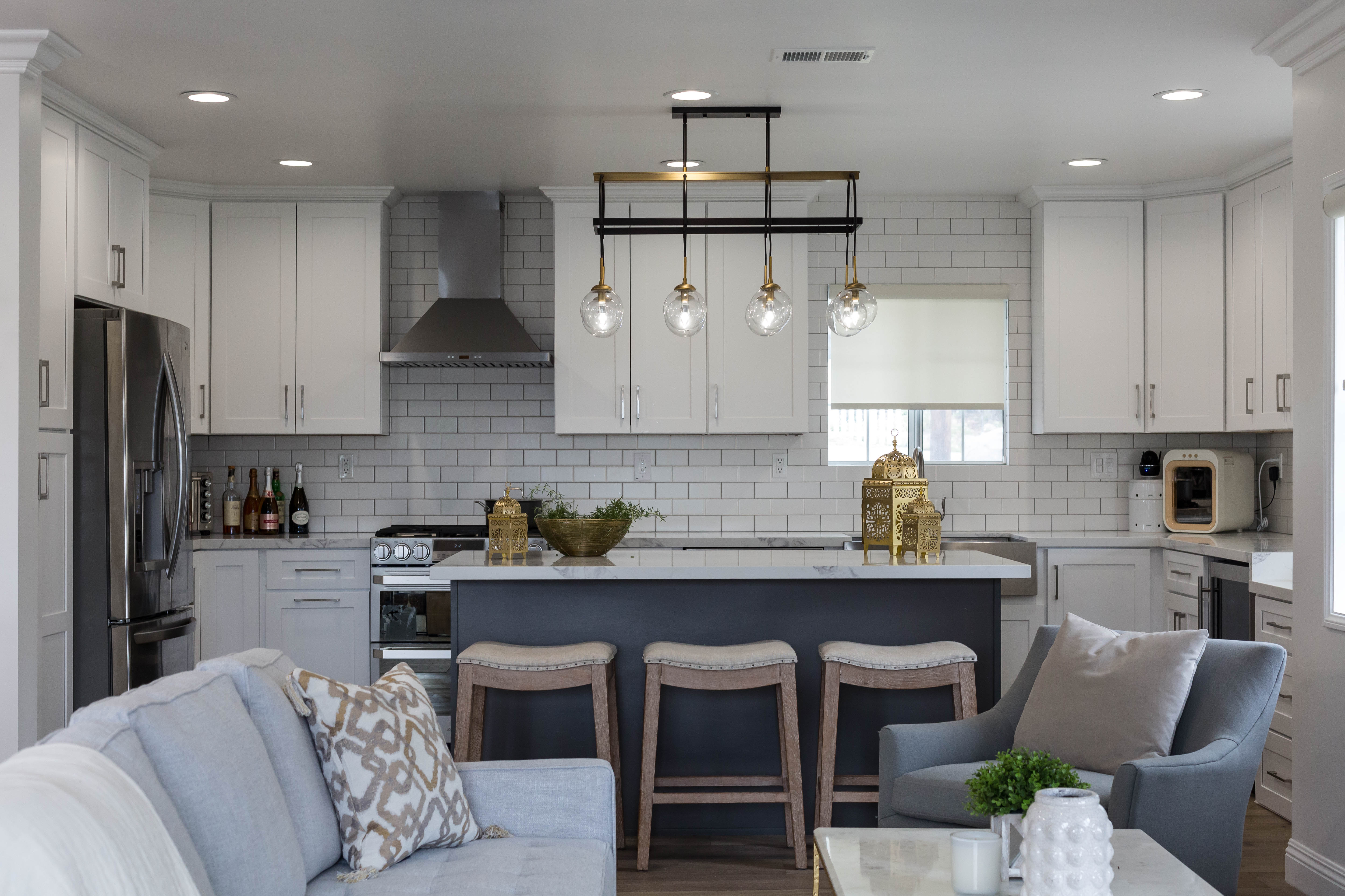
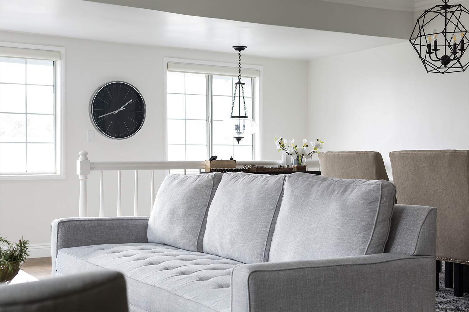
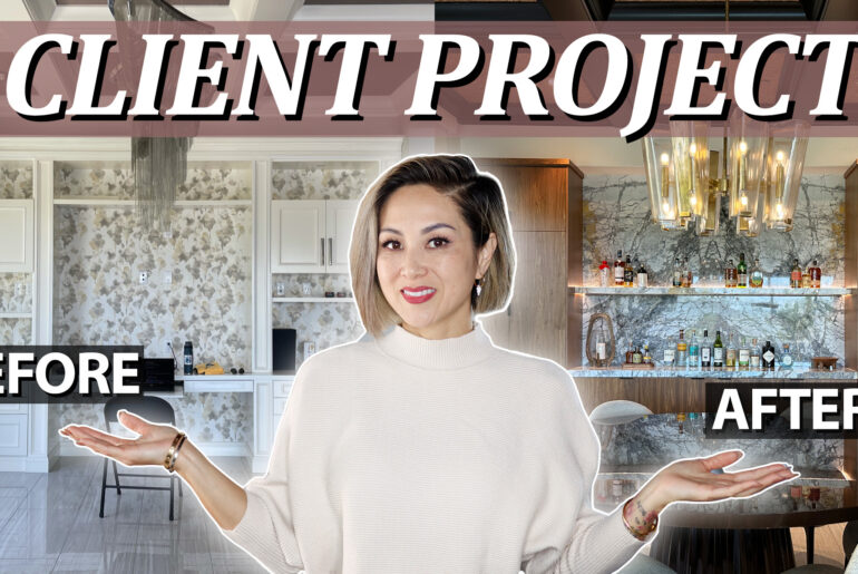
The BEFORE was atrocious guys. Weird kitchen layout that had zero functionality, brazen red walls, lackluster spirit and style, the home was a total fixer upper to say the least. We wanted to open up the space, keep everything light, bright and airy, focusing our attention on luxe lighting fixtures and designer details. Since you had total visibility of the living room, dining room, and kitchen as soon as you walked in the entry door, we needed a harmonious design that carried your eye from room to room without any distractions.

Materials and Finishes
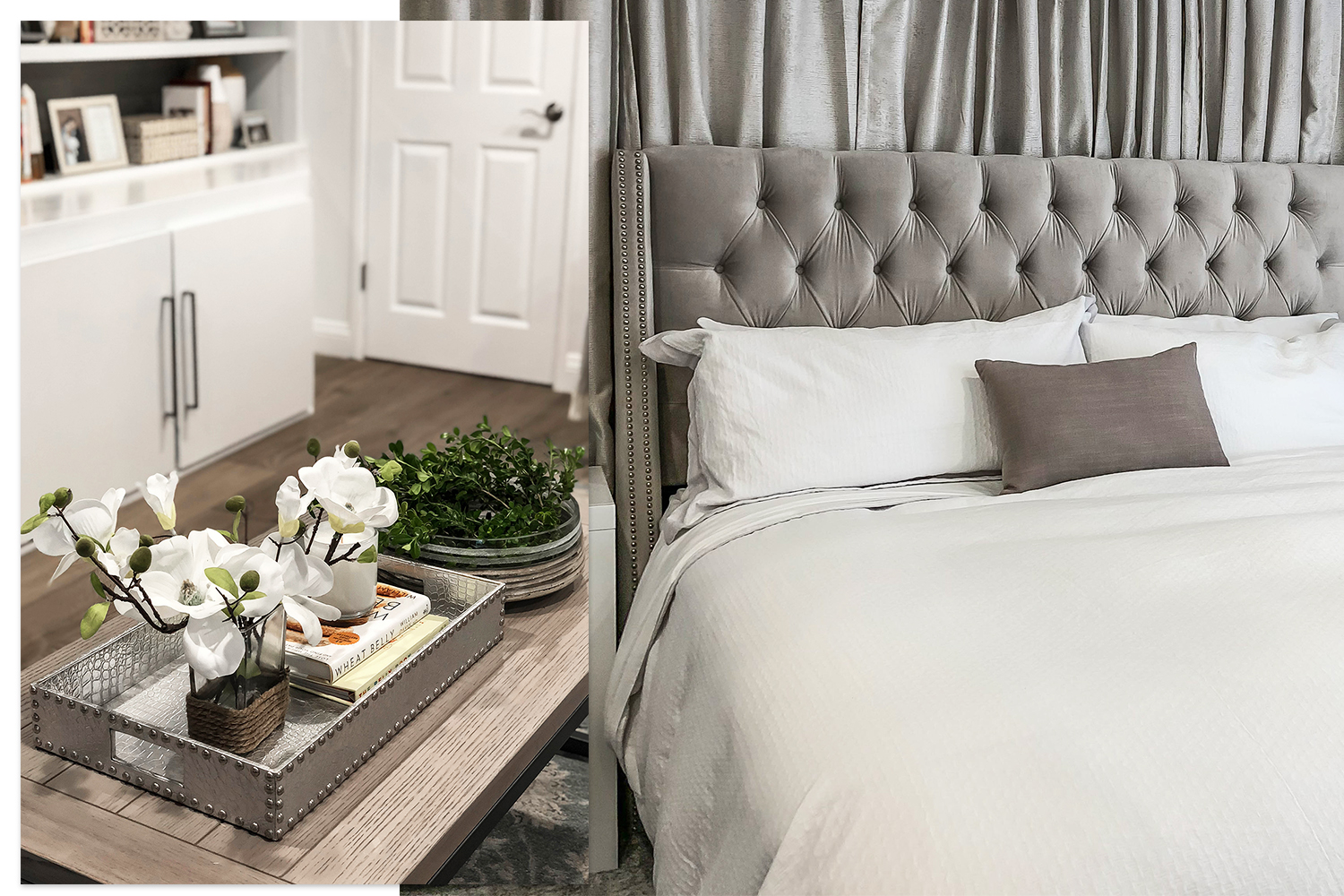
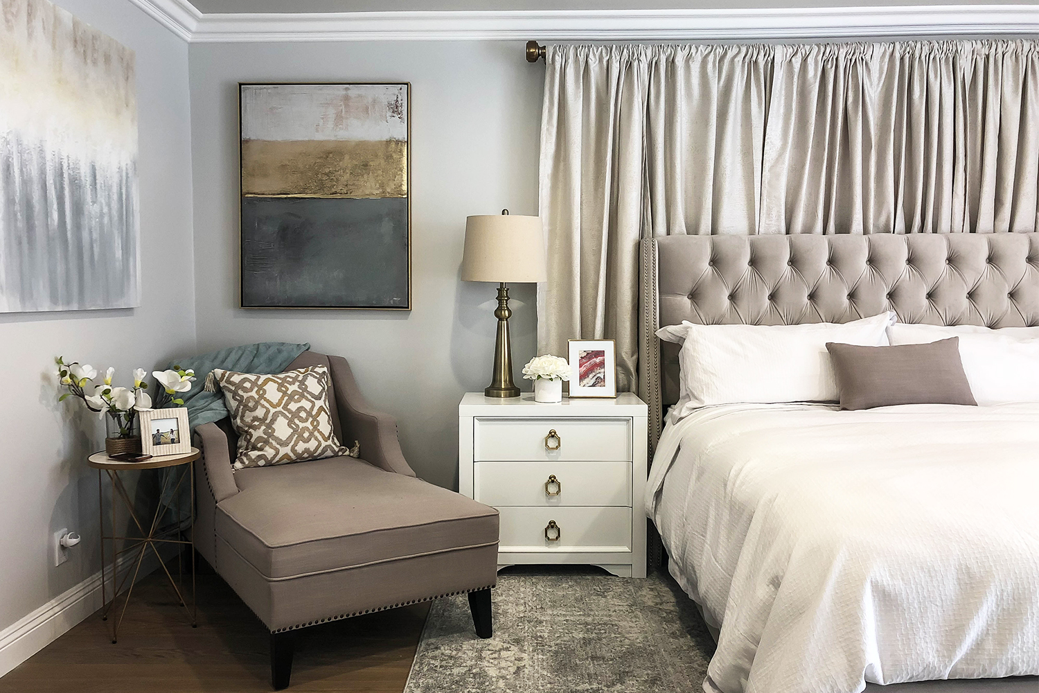
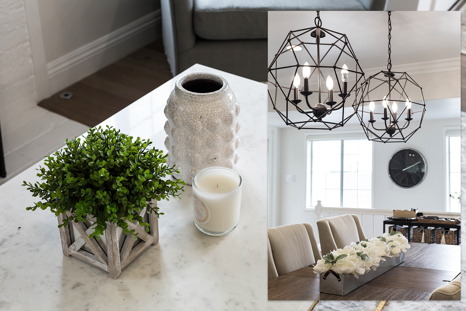
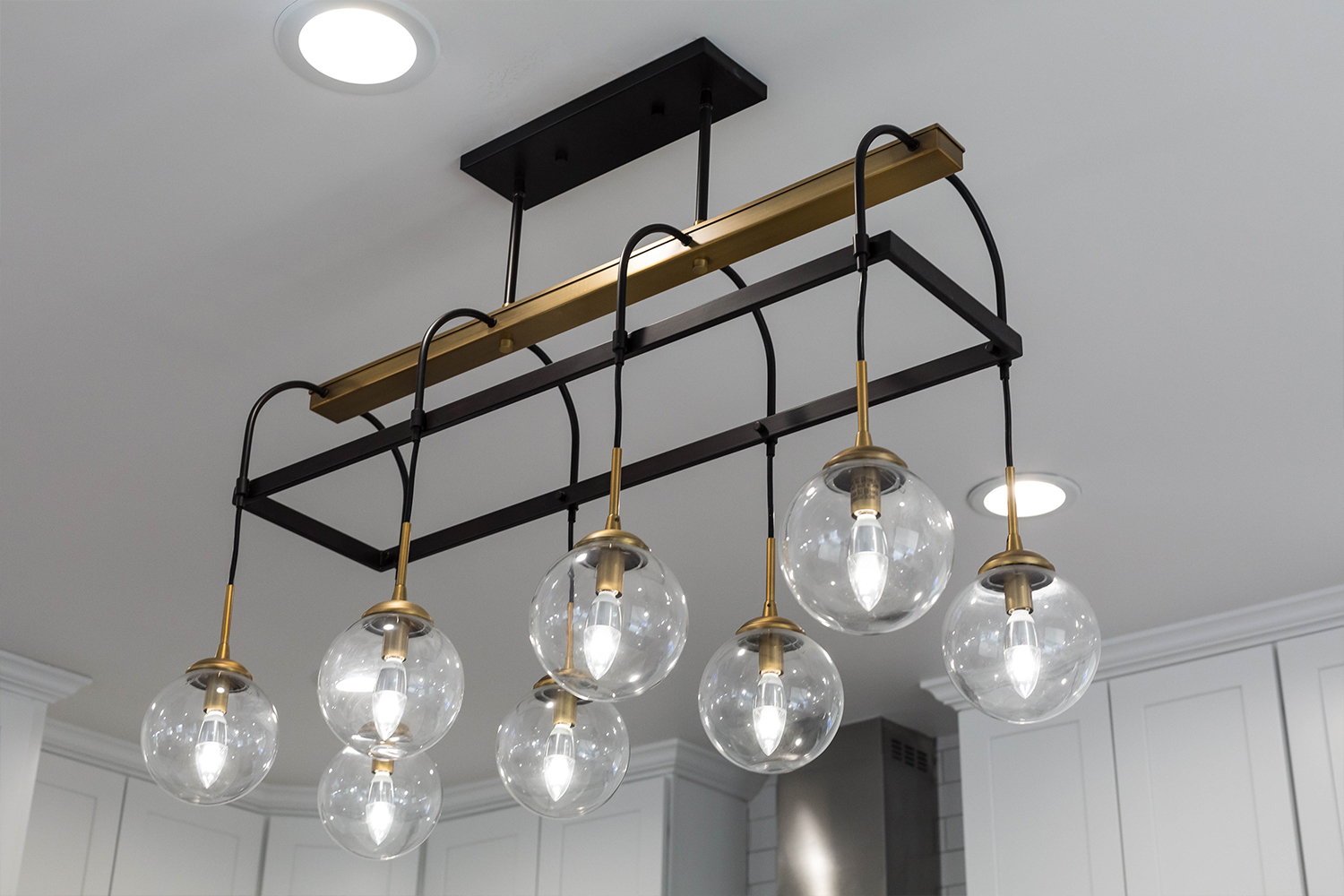
My signature touch of metallic goes such a long way in a single family residence like this. The reflective surfaces help to bounce light around leaving a glimmer of sheen in every nook and cranny. I love layering golds with silvers, black with white, natural marble with raw wood; the juxtaposition of finishes adds a dynamic touch to any space and helps to elevate the design from basic to BAM!
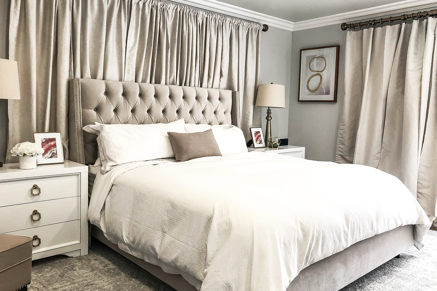
The trick to designing neutral interiors without a ton of color is to layer textures.
Velvet with silk, leather with cotton, wool with linen, the more you layer, the cozier it looks.
Art, Furniture, and Accessories
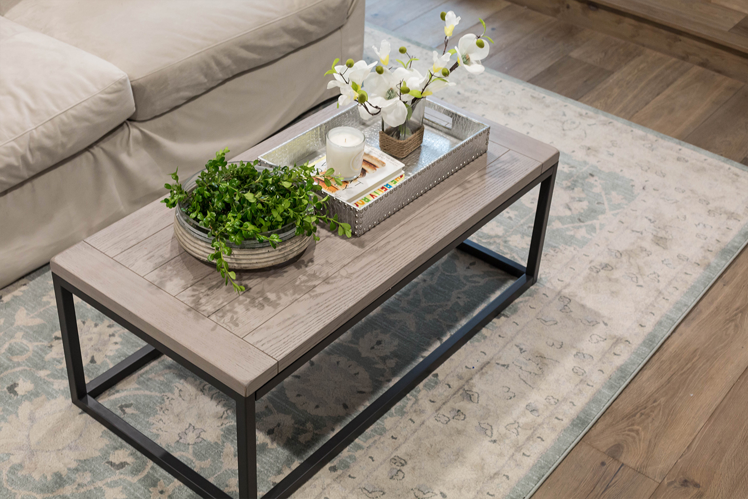
HomeGoods has been my go-to source for last-minute styling since I started my business over 10 years ago! Where else can I comb through racks of goodies and leave with cart loads full of designer accessories for a fraction of the cost? This saves my clients TONS of money and allows me to splurge in other areas like classic furniture that can transition from home to home.
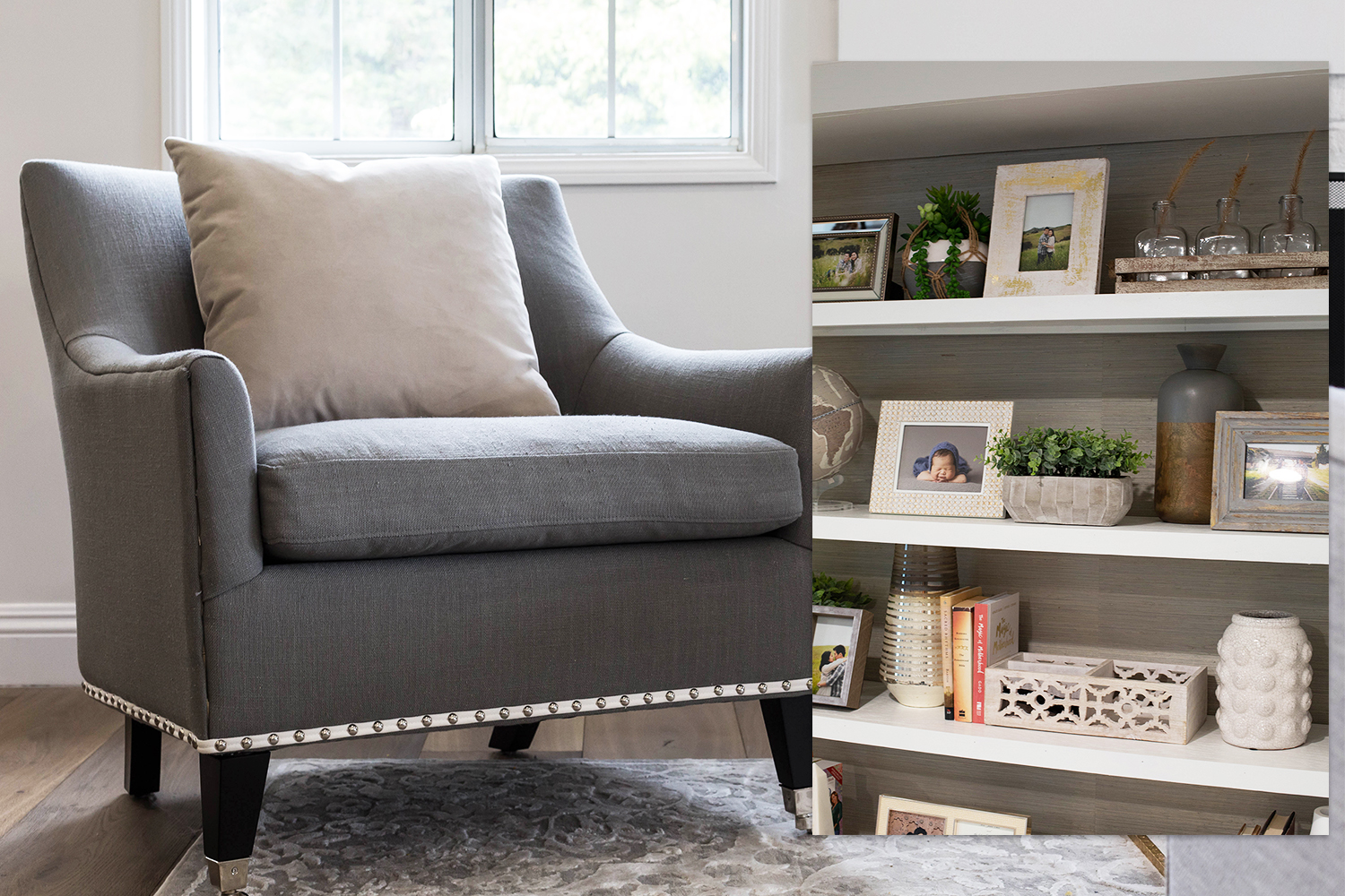
SHOP THE LOOK
Entry
- Storage Bench http://bit.ly/2T5H6w1
- Console Table http://bit.ly/2Ew0R63
Dining Room
- Extendable Dining Table http://bit.ly/2T64NEv
- Dining Chairs http://bit.ly/2T7JOB2
- Wall Mirror http://bit.ly/2EjqDdw
- Pendant Lights http://bit.ly/2Ej0Wd2
- Area Rug http://bit.ly/2Eo7Z44
- Faux Floral Centerpiece http://bit.ly/2EkZxmf , http://bit.ly/2EnVjdo
Kitchen
- Pendant Light http://bit.ly/2Ep37Ml
- Counter Stools http://bit.ly/2EnFROz
- Quartz Countertops https://bit.ly/2BXNQ4y
Living Room
- Sofa https://bit.ly/2EqR154
- Marble Coffee Table http://bit.ly/2T7Jm69
- Armchair http://bit.ly/2T4DNFs
- Area Rug http://bit.ly/2T90Fnk
Master Bedroom
- Bed http://bit.ly/2T6B3Y8
- Nightstands http://bit.ly/2Em3vuZ
- Wall Sconce http://bit.ly/2Eo847S
- Dresser http://bit.ly/2T7AM7r
- Chaise Lounge http://bit.ly/2T7BIIZ
- Side Table http://bit.ly/2EiMLoi
- Table lamp http://bit.ly/2EjxGTw
- Drapery Hardware http://bit.ly/2EmAM9m , http://bit.ly/2Epapjb
- Drapery Panels http://bit.ly/2EmDziQ
Basement | Den
- Sofa http://bit.ly/2U8adeg
- Club Chair http://bit.ly/2EiFnt4
- Area Rug http://bit.ly/2T4aFOB
- Coffee Table http://bit.ly/2EkQ12v
- Side Table http://bit.ly/2TaSBm9
- Rolling Bookcase http://bit.ly/2TaVm6H
- Artwork http://bit.ly/2T7MbUs
- Drapery Hardware http://bit.ly/2EjG4Cj , http://bit.ly/2Emkxce
- Drapery Panels http://bit.ly/2T7JC4P
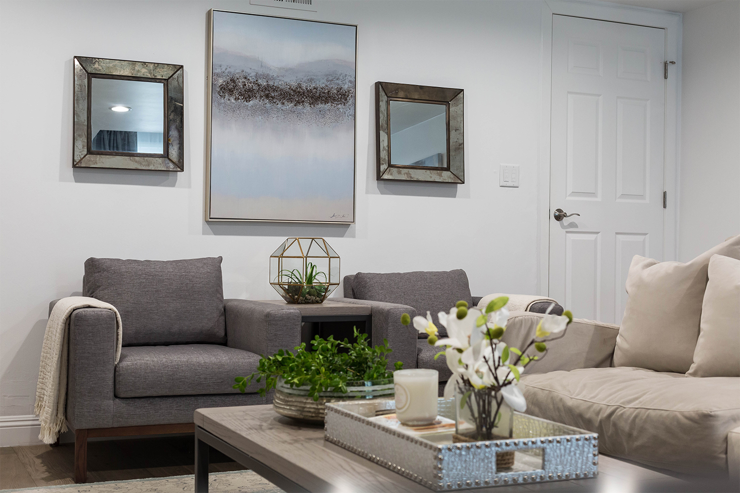
Designer’s Tips:
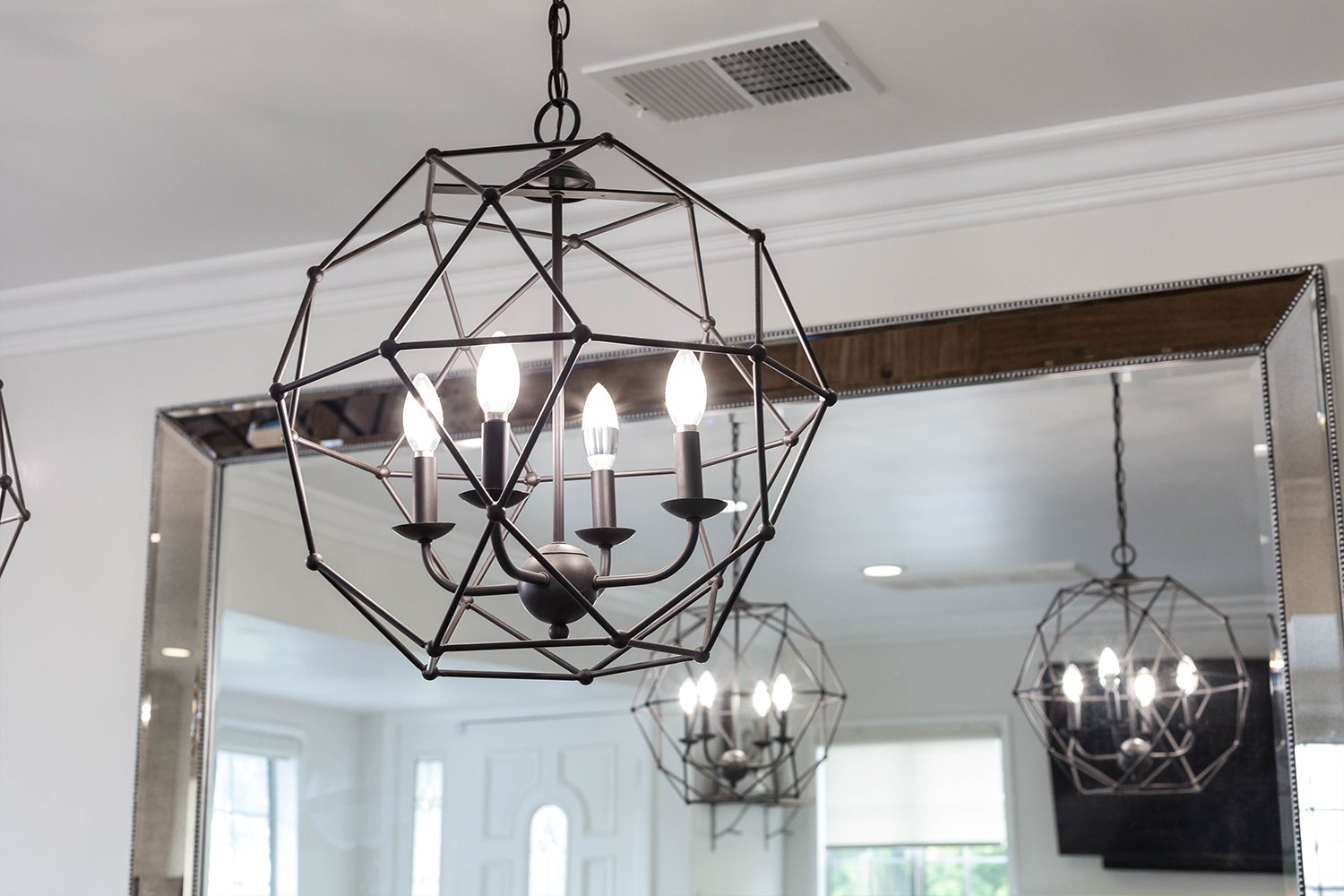
- Statement lighting makes your home look expensive. Invest in cool pieces that pack a punch and start a conversation.
- Use a palette of light neutrals to make spaces look larger and brighter. My fave neutrals always have a tint of blue or a hint of pink. Muted colors say warm and fuzzy without trying too hard. Perfect for you color novices out there!
- When designing with gray tones, always add in brass to offset the coolness (that can easily read as institutional).
Closing Thoughts
Hope you enjoyed my latest project #JKID_LaCrescenta. I have been working hard to start my YouTube channel and we’ve got a super fun home tour of this beauty BELOW!
Please let me know what you think of our new content and if we should bang out more of these! Thank you for watching!
For more looks from #JKID_LaCrescenta see the FULL PORTFOLIO here.



1 Comment
Hi Julie, I love this home design and palette! What color are the walls in the main living area and bedroom? It looks great in all of the lighting!