Coastal cool living with a mixed-metallic palette, my latest interior design renovation #JKID_LagunaHills has it ALL and then some!
The Client
One of my favorite designs created for one of my favorite clients. Dave found me way back in my HGTV Design Star days (circa 2010) and I’ve had the absolute pleasure of designing his then bachelor pad to a grown-up condo with his fiancee, and now their gorgeous first home together as husband and wife!
See Dave’s bachelor pad HERE and his grown up condo HERE.
The Concept
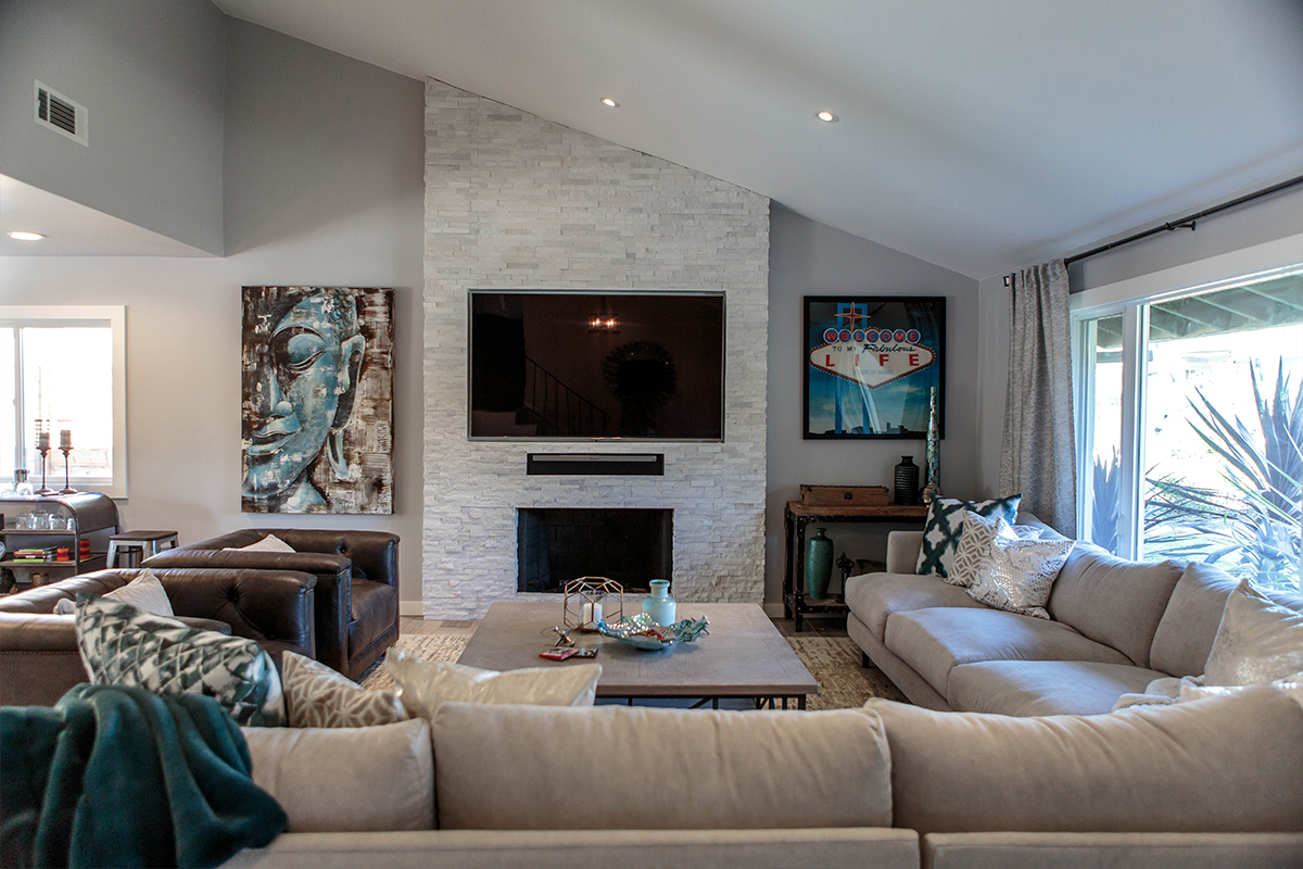
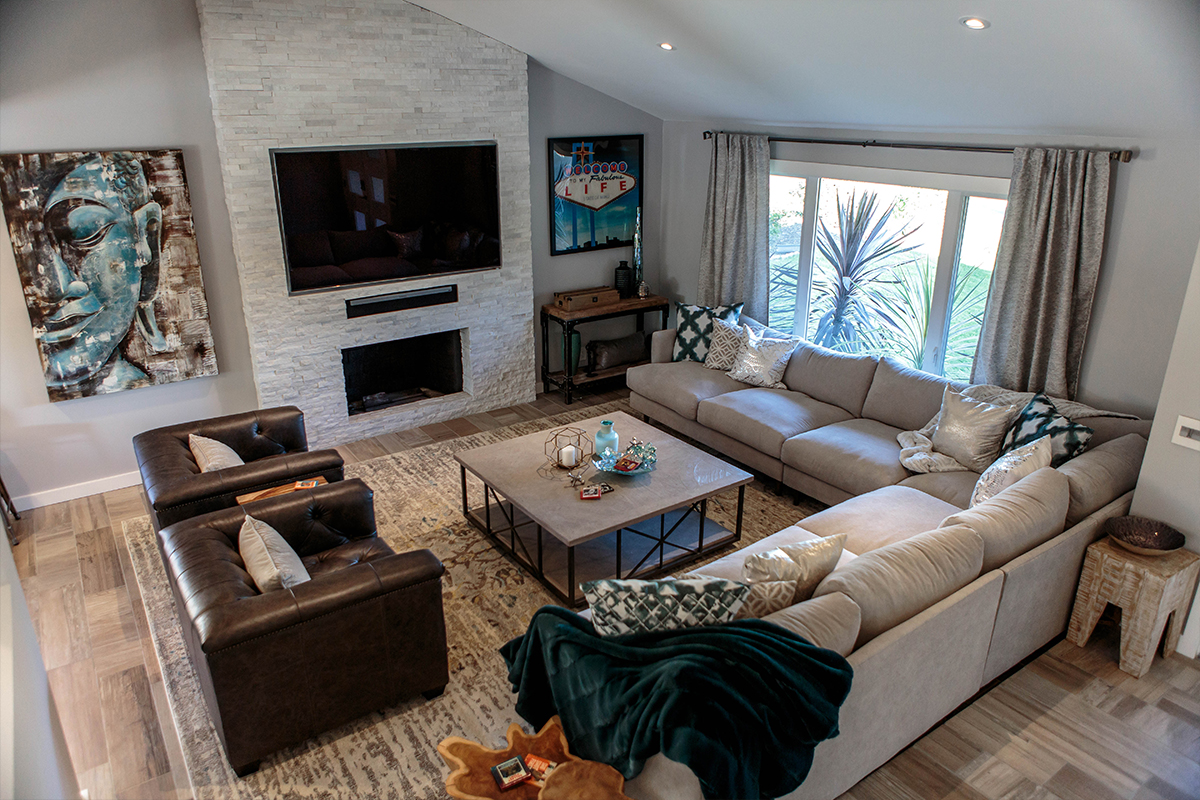
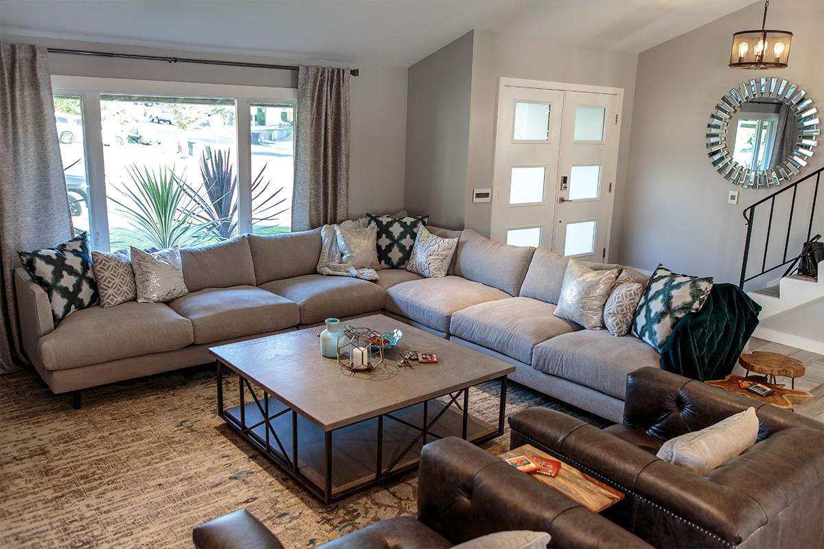
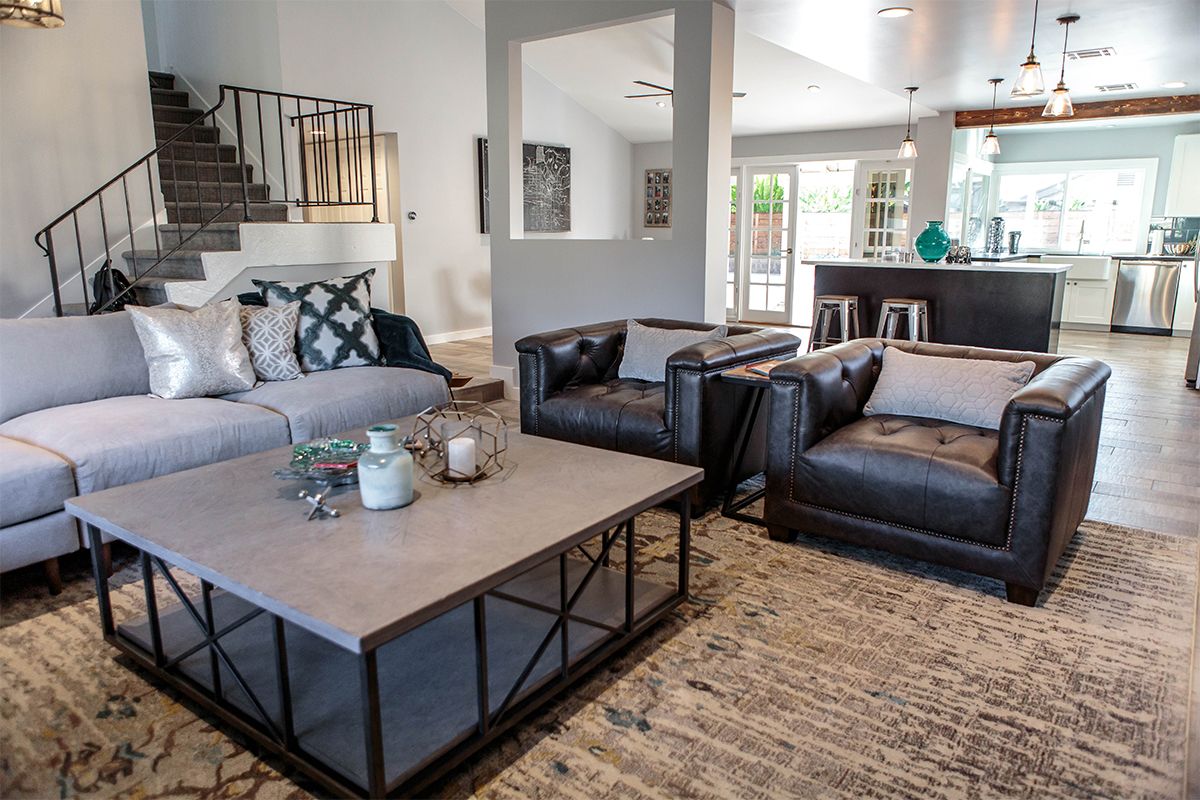
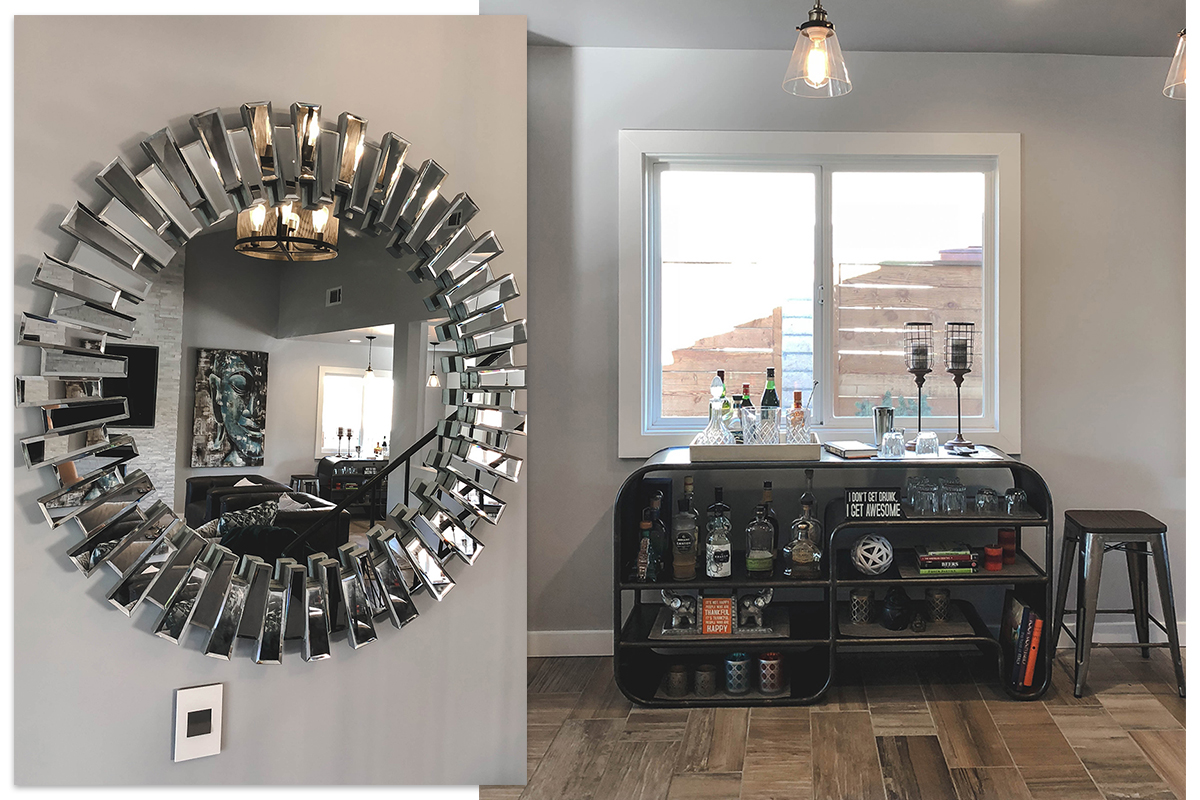
We started with a neutral palette of whites and grays and sprinkled in a mix of silver and gold metals for accent. With high vaulted ceilings, I kept all the furniture low and loungey, allowing complete visibility of all the common areas no matter where you are standing.
This trick not only makes the ceilings appear higher, but makes the space seem larger as well.
I anchored the living room with a massive 12ft custom sectional from Living Spaces and flanked 2 leather club chairs to square off the space.
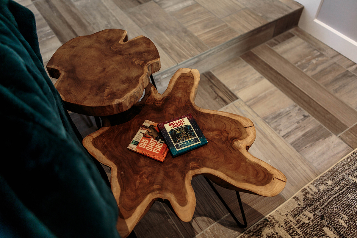
Materials and Finishes
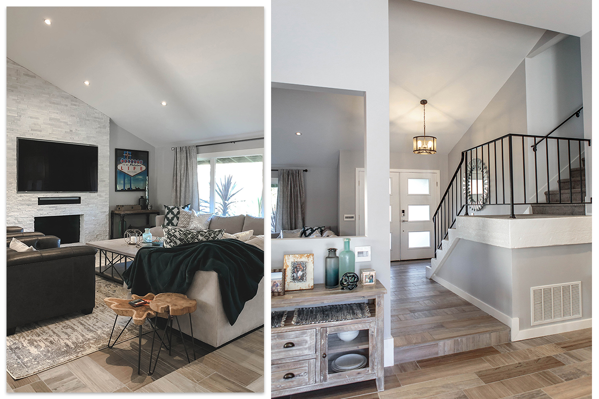
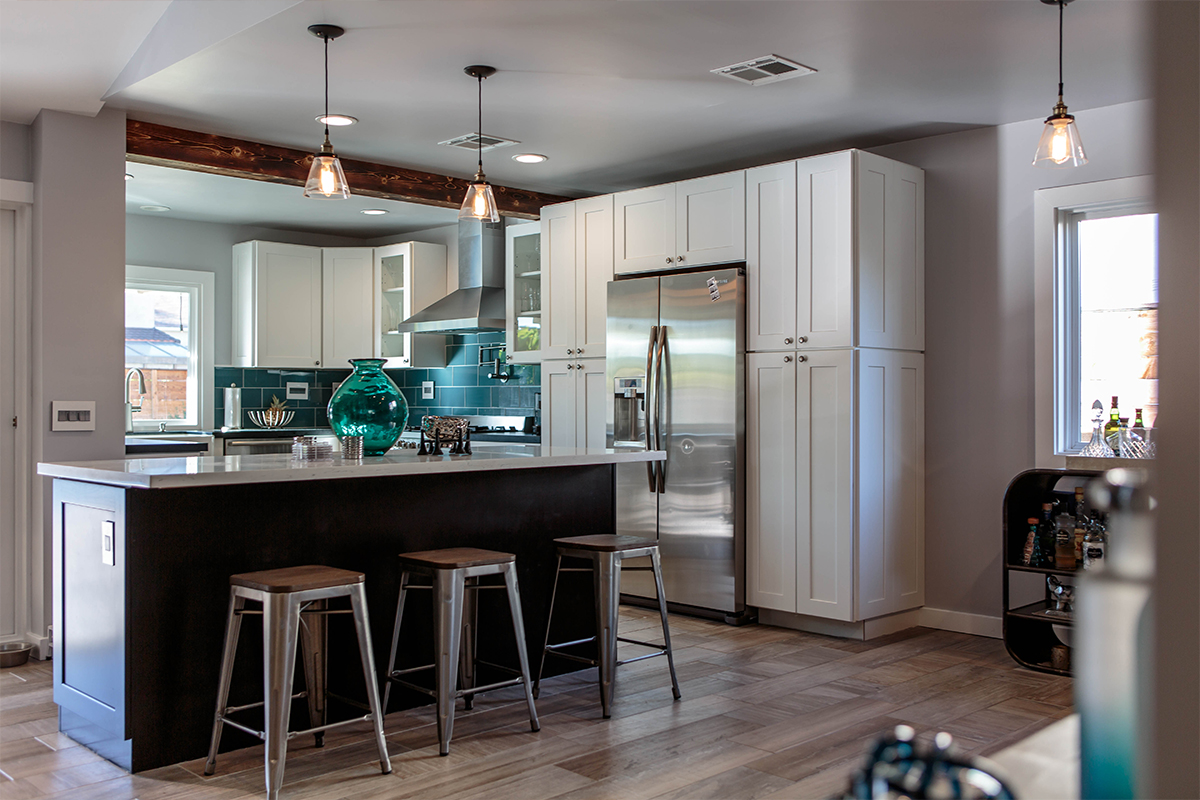
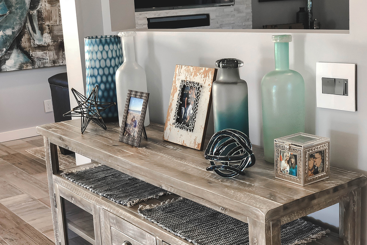
The client already had this beautiful multi-toned porcelain tile that looks like wood planks for flooring. I used the tones of the planks to pull colors for the space, keeping everything light and minimal. The only major color are blues and grays, reminiscent of the blue waters of nearby Laguna Beach.
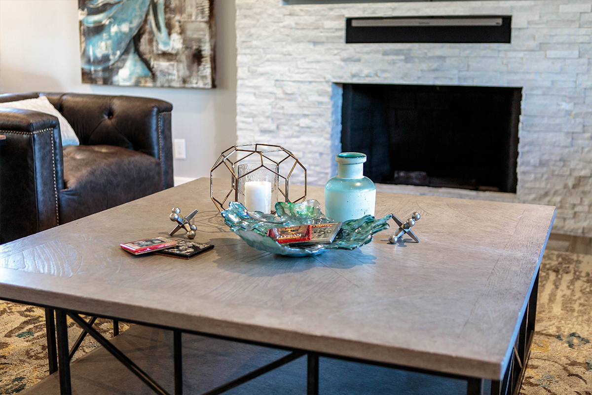
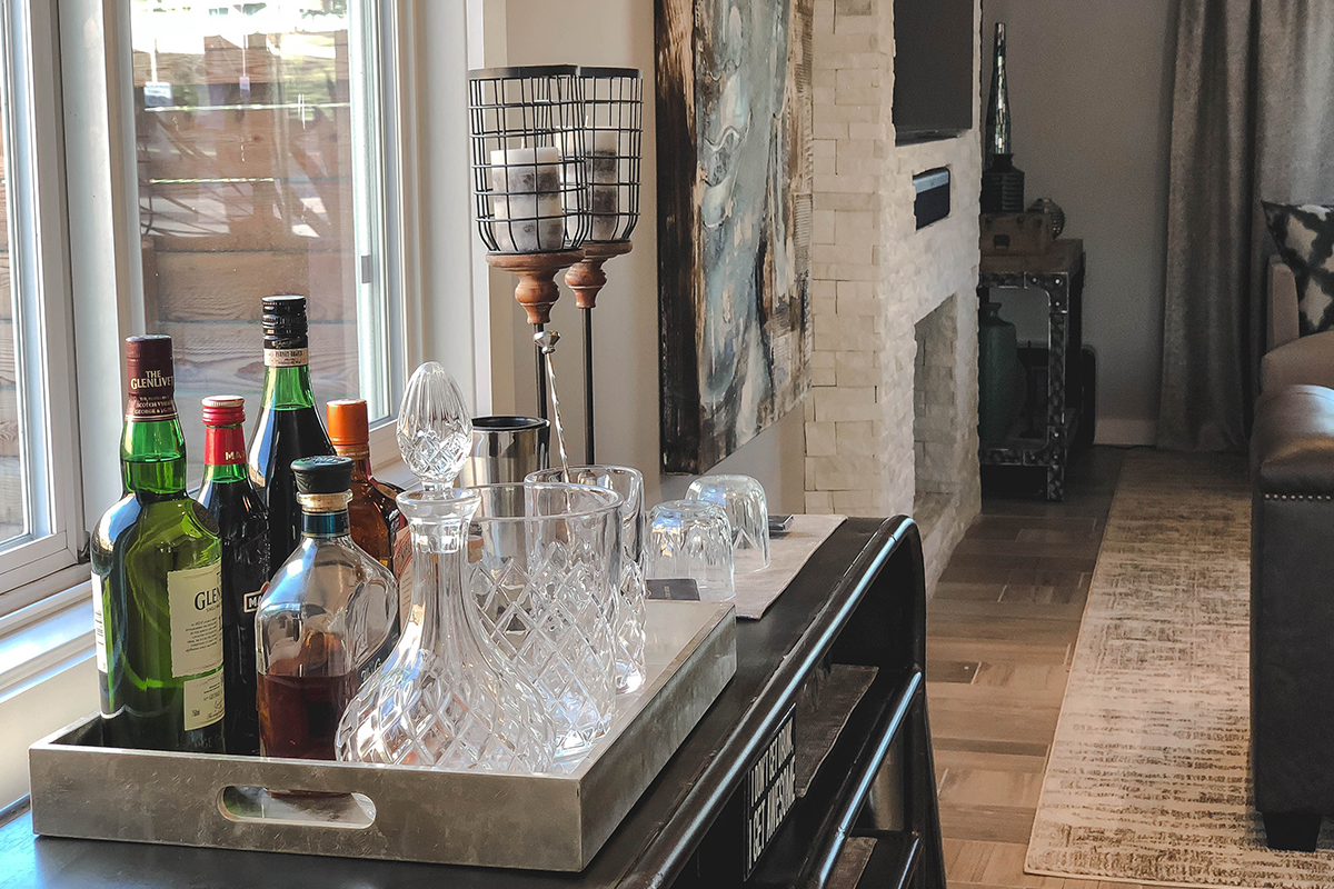
One of the first things we demolished in the space was the old dated fireplace. I knocked out the brick and wood mantel, built out a new box for the TV niche and soundbar, et Voila! Beautiful new modern fireplace featuring stacked ledger stones in a crystal white finish that sparkles all over the living room.
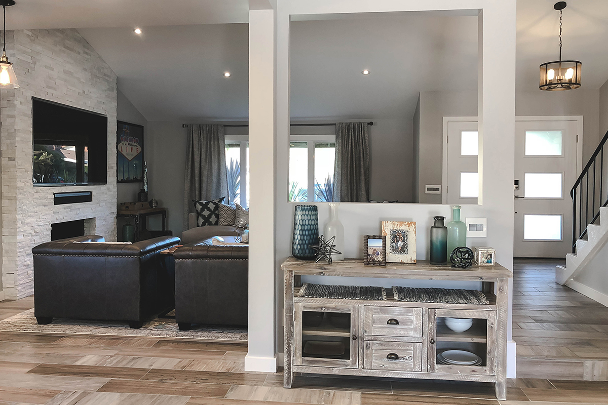
Art, Furniture, and Accessories
Also notice how we kept some statement art pieces from one home to the next. Don’t be afraid to splurge on big ticket artwork guys! When you LOVE something you will MAKE IT WORK, from space to space, year after year!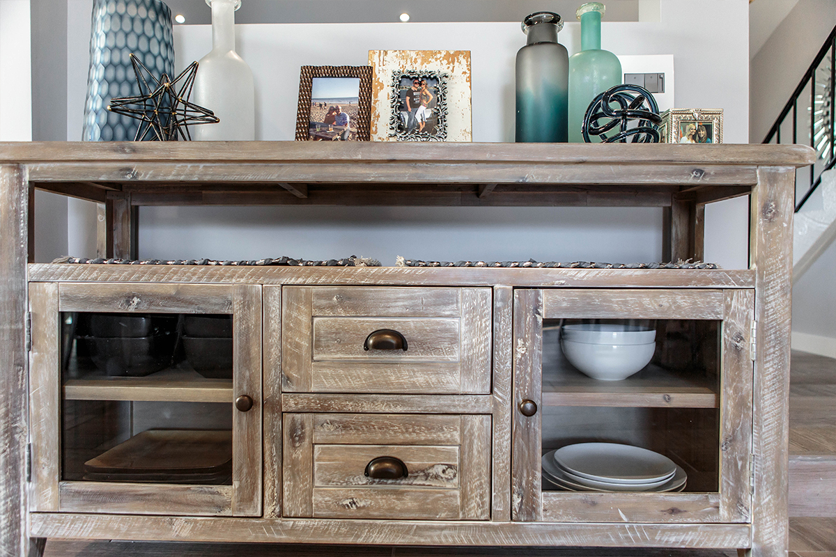
Designer’s Tip:
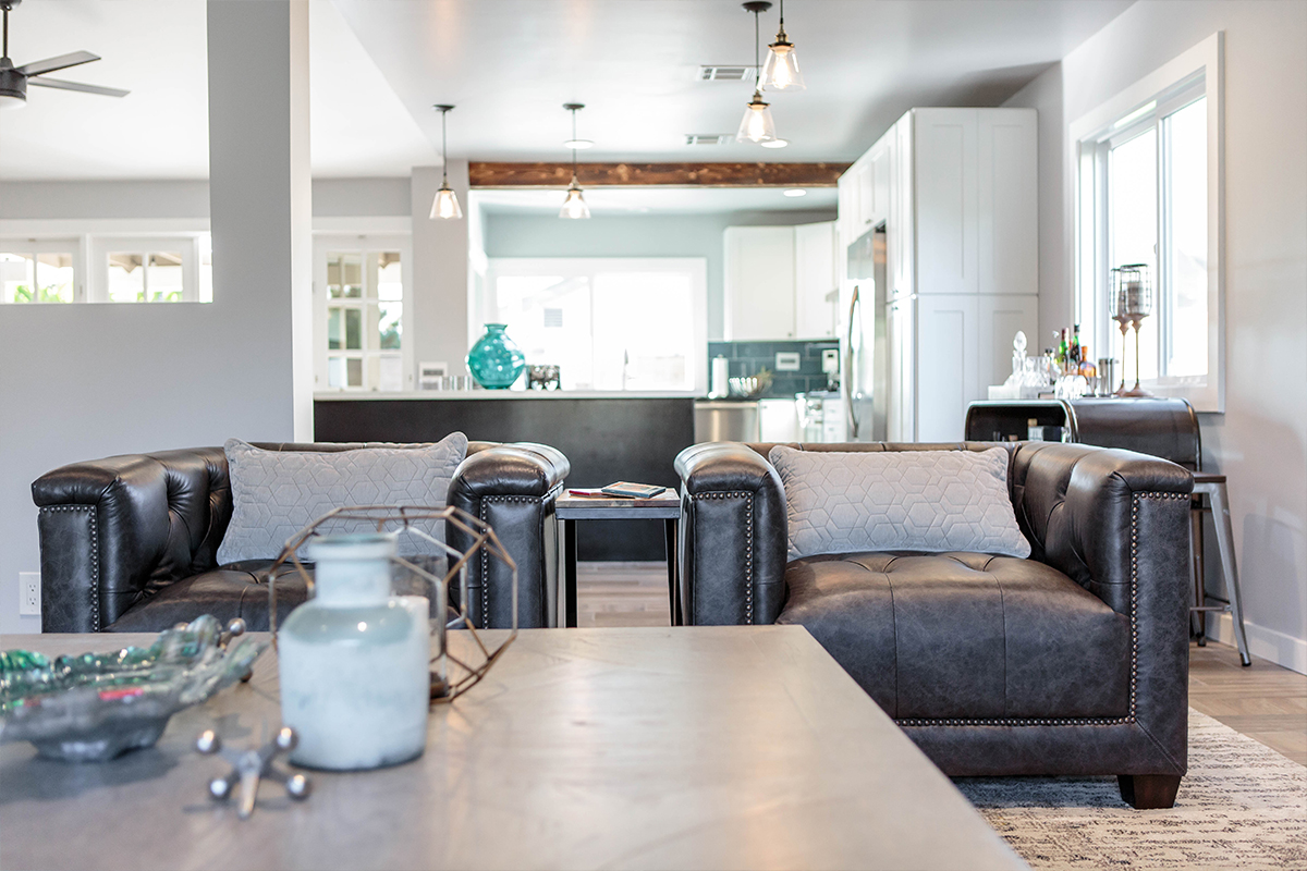
Keep the common areas relatively neutral and add in colors with accessories and artwork. Here, turquoise and blues become our accent color, pulling in hues from the kitchen backsplash as well as the large artwork seen from the living room to the bar. When you grow tired of the accent color you can simply swap them out for a fresh new look! All without having to pay thousands for a complete overhaul!
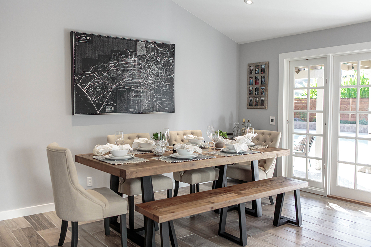
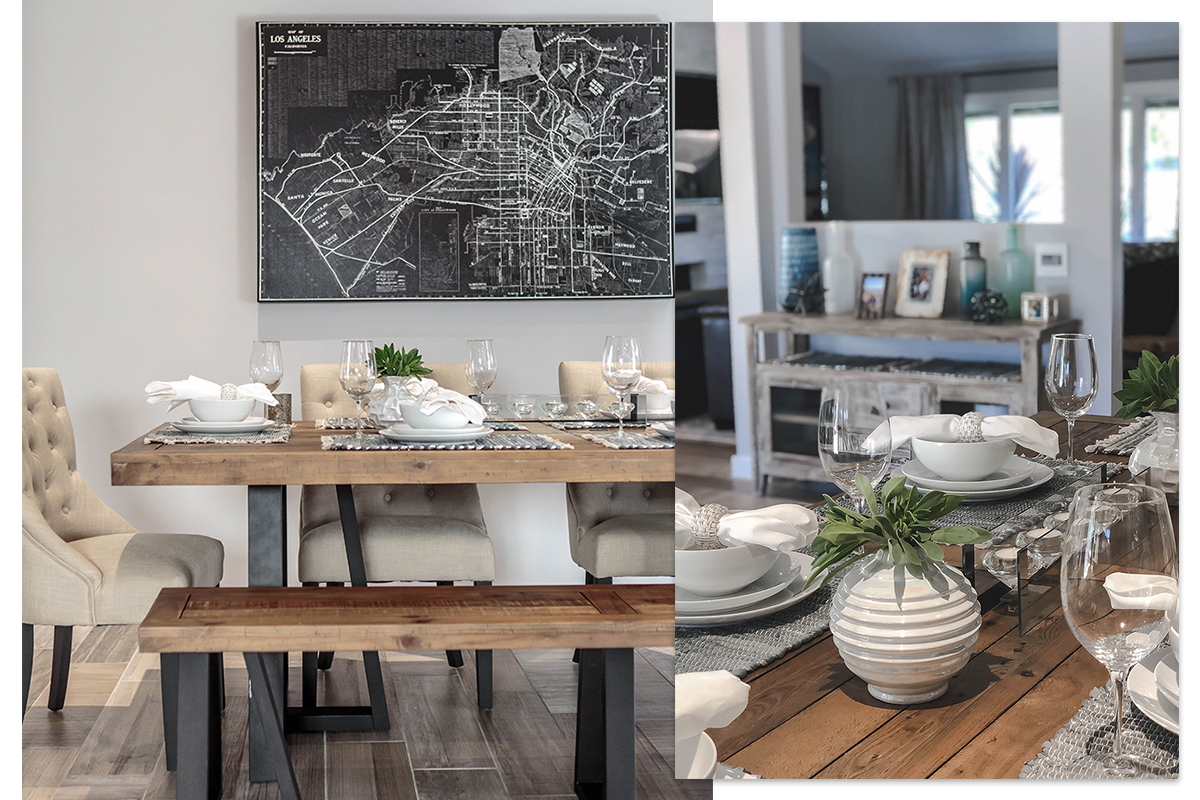
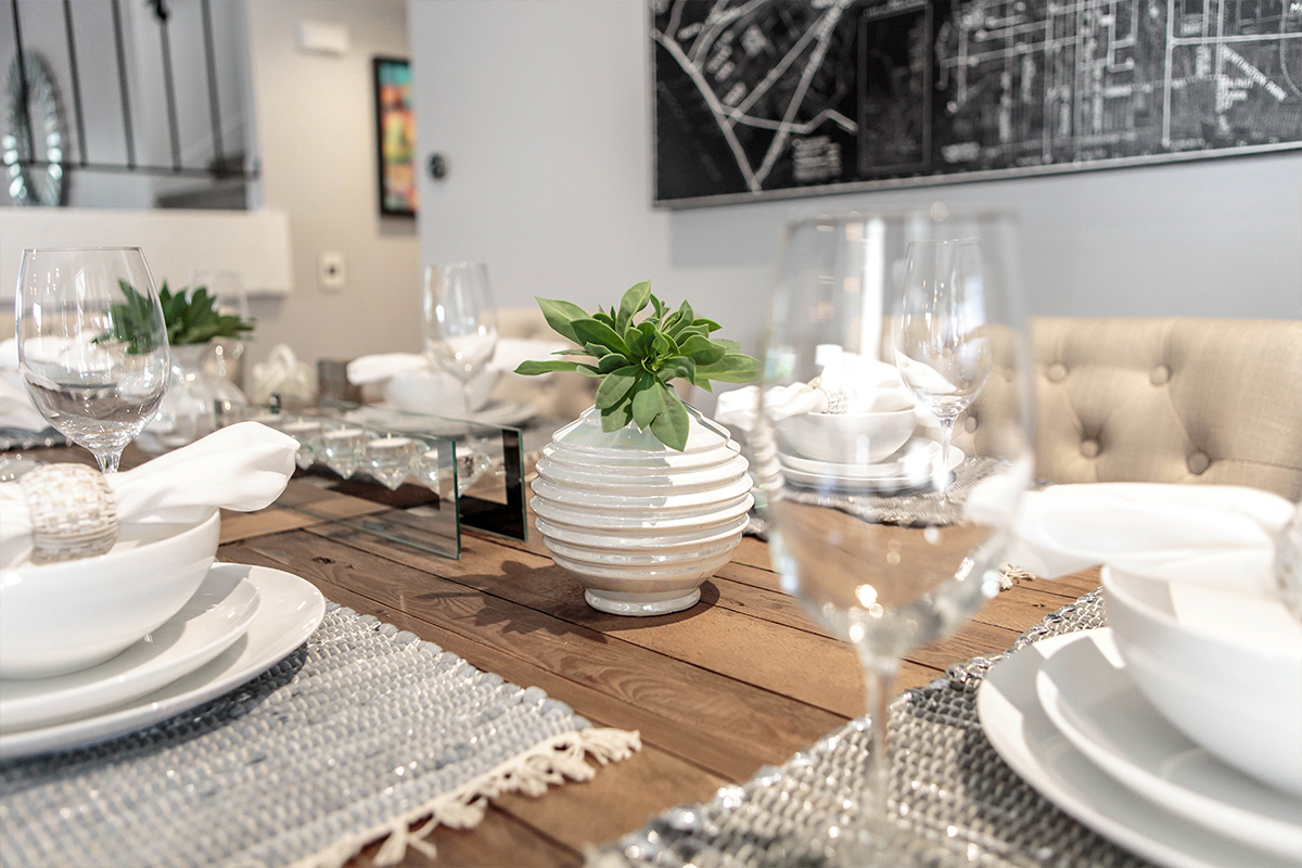
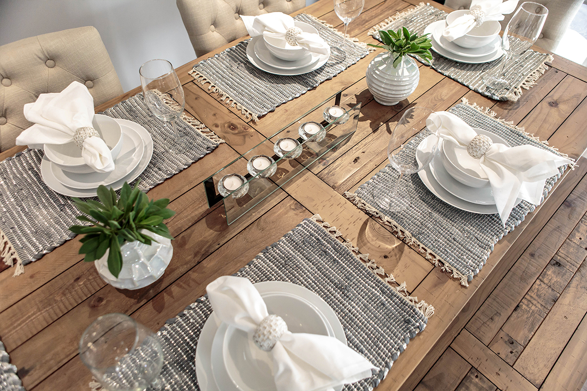
I like to keep the dining table set at all times. You never know who might drop by for a last minute visit! Having your tabletop completely laid out allows for more time to clean up clutter everywhere else!
Closing Thoughts
Neutral spaces don’t have to look tired and boring guys! Mix in metallics for a touch of glamour. Anchor each room with a large area rug or large piece of art so you don’t lose the individual personality of the space. Use a variety of raw textures and unfinished surfaces for that lived-in feel and most importantly, choose pieces that are functional FIRST and transitional so no matter where go from here, the pieces can grow alongside with you.
For more looks from #JKID_LagunaHills see the FULL PORTFOLIO here.

