Who doesn’t love a good transformation?
The very reason why we tune into daytime talk shows especially when they’re featuring some sort of makeover…The very reason why HGTV’s on the top of my hit list…and why DIY network’s very close behind…From a complete gut renovation to some major architectural detailing…Here’s how I transformed a once outdated inn from super stale to fashionably FAB!
R E C E P T I O N
The Plan
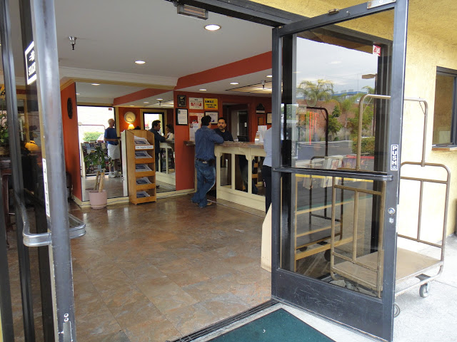
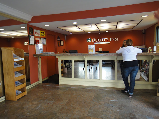
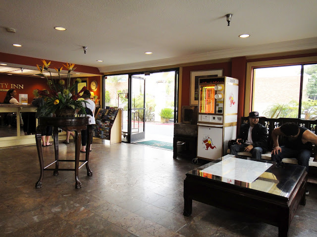
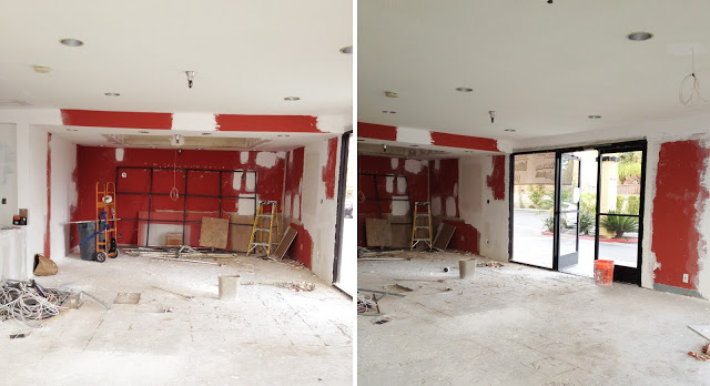
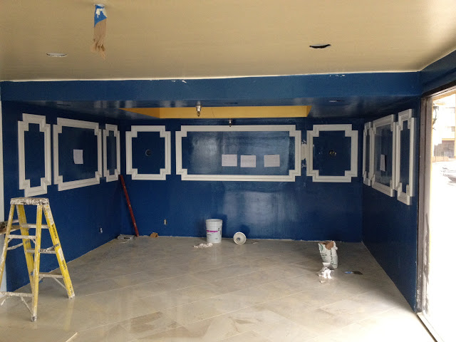
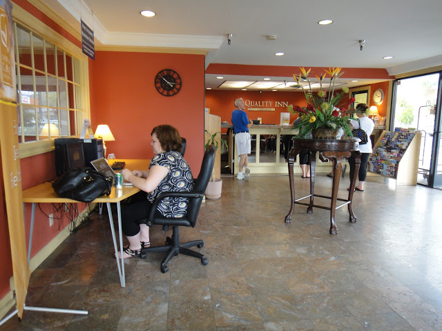
First off, the floor plan was all wrong. Upon entry, guests were greeted with a reflection of themselves in a floor to ceiling mirror (see first pic) instead of a receptionist. Standing reception almost feels too cold and casual so I opted to transform this tiny box into a custom banquette space instead. That way, you can drop off your bags at a plush seating area instead of right on the floor where dirt and debris can get to it.
The Finishes
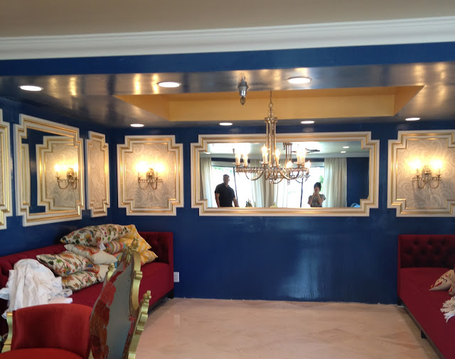
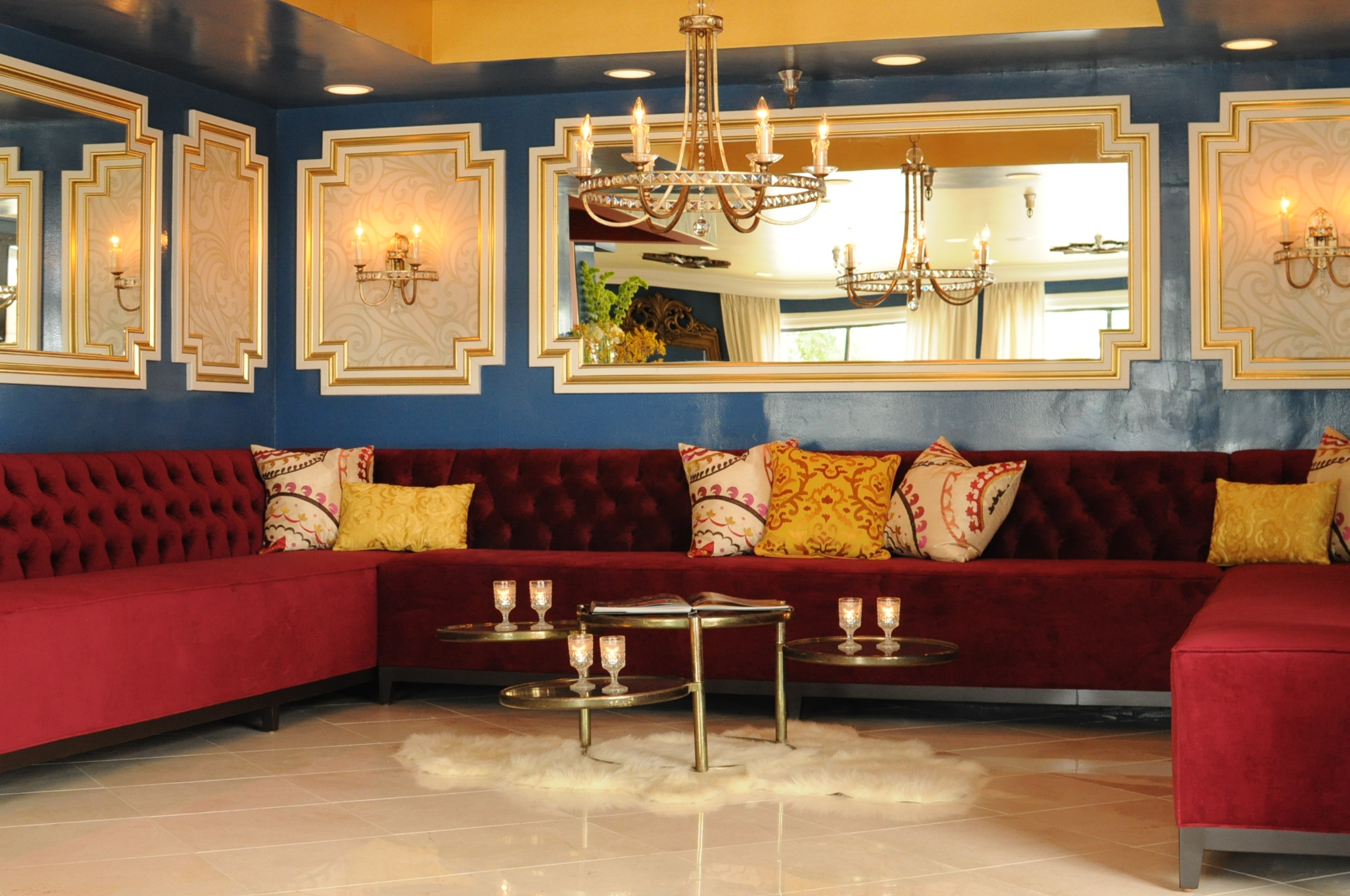
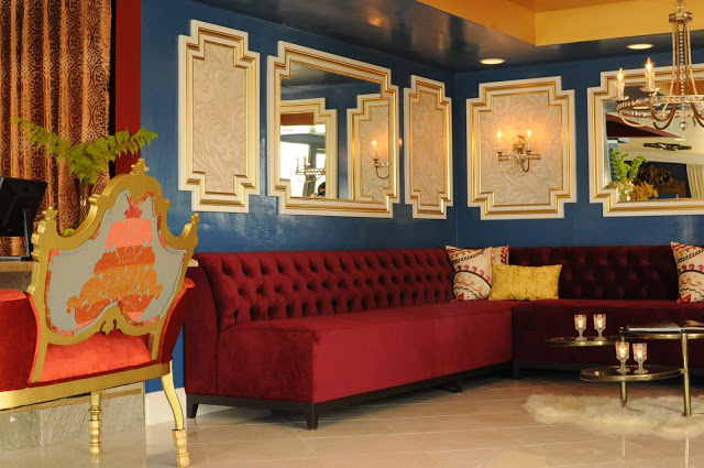
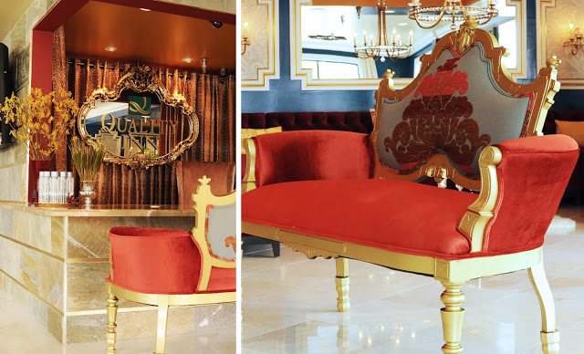
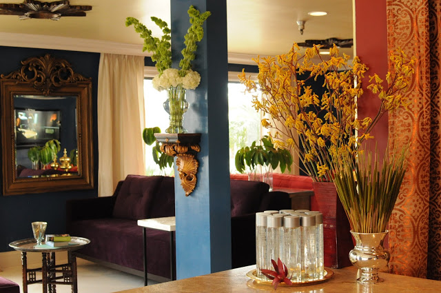
Next came paint, lighting, a customized wall-to-wall velvet banquette, and some fabulous architectural details like panel molding gilded in the most glamorous metallic to really help the space shine like a jewel box of a hotel. Mirrors double the space while reflecting much needed light into this abandoned windowless corner.
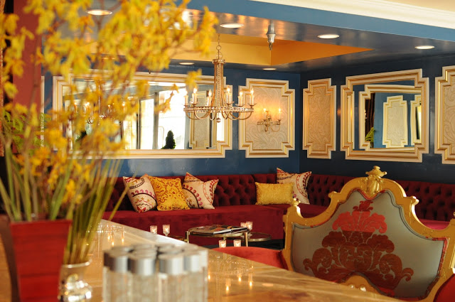
Doesn’t the space immediately feel more inviting??
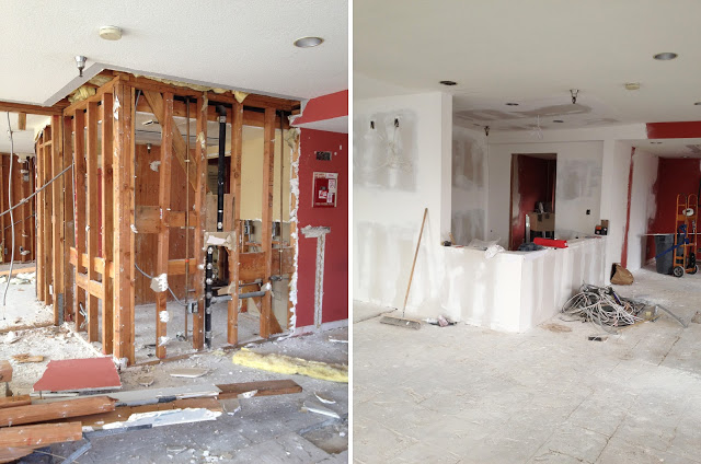
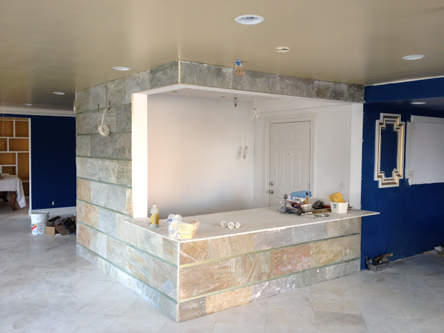
New Reception Area
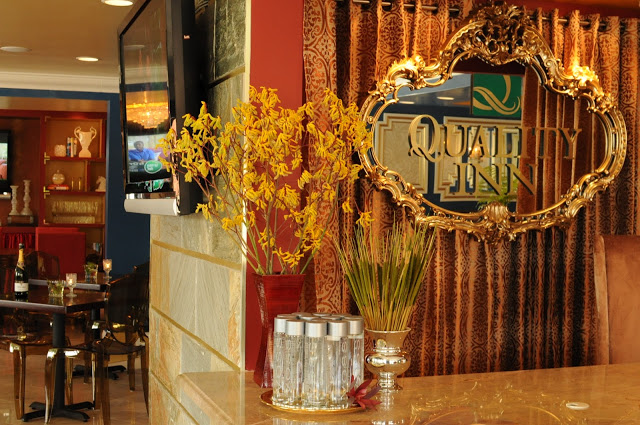
Next came the new reception area. I’ve always wanted to design a small hotel with seated reception since it’s a departure from the expected and sooooo much more glamorous to outfit. Since the first impression is the most important one, I draped the walls in a rich printed brocade to mimic a grand theater interior. Almost like a sneak peek into the main attraction.
Challenges
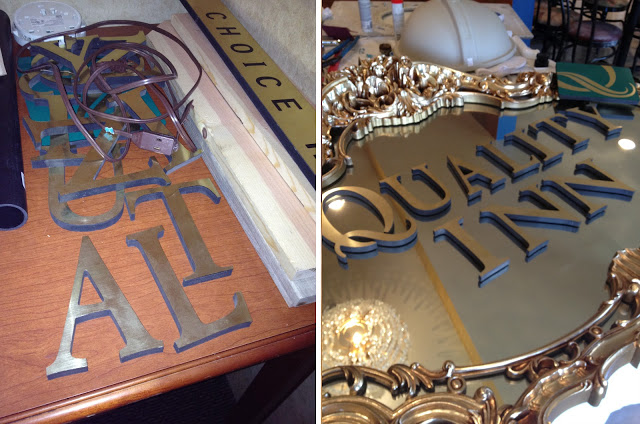
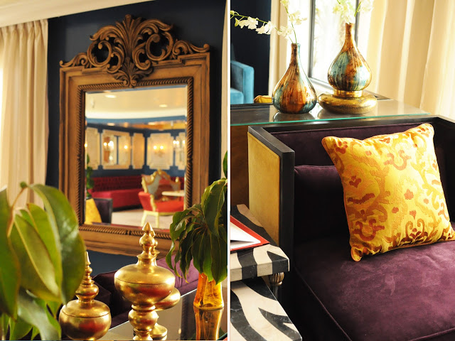
When dealing with a franchise, it’s always prudent to know what’s required in the event of a re-design. For example, Quality Inn has specific signage that needs to be incorporated and featured at reception. I had these individual letters that were required for signage so instead of backing them onto just any ol’ board, I found this gorgeous antique mirror with just the right amount of glam and gold to accent the space. Not only does the brand become front row and center, it’s highlighted in such a stylish way, guests look forward to seeing what’s in store for them during their short stay. Anticipation is an integral proponent to the most memorable designs!
L O B B Y
Finishes
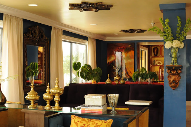
I abhor structural beams. The bane of my design existence but a typical challenge nonetheless. Instead of cladding this honkin’ piece of steel in mosaics and hard stones, I opted to keep it simple. Gypsum and some paint should suffice. Now she’s an architectural centerpiece to the lobby design. Perfect for rotating fresh seasonal flowers or artwork!
Space Planning
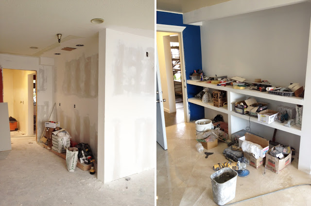
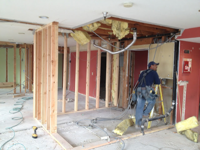
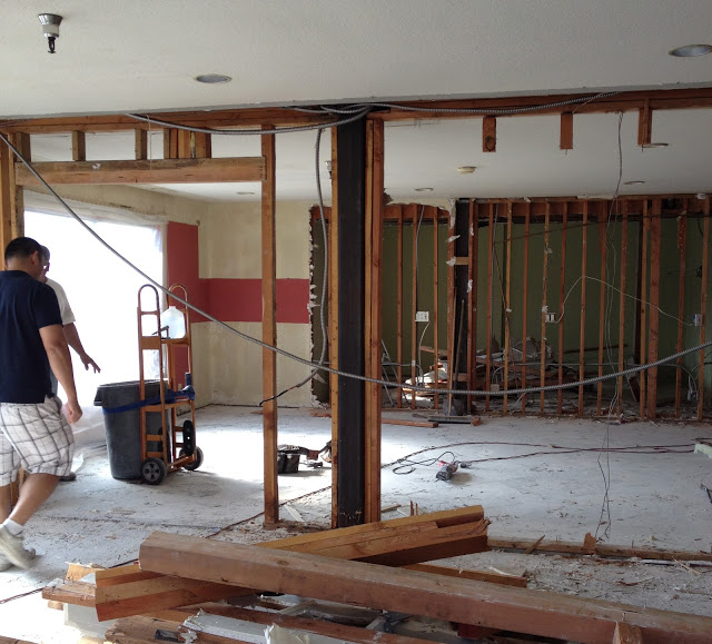
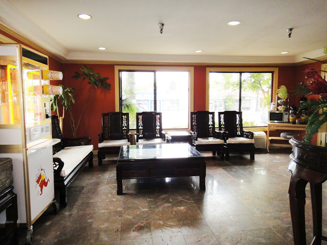
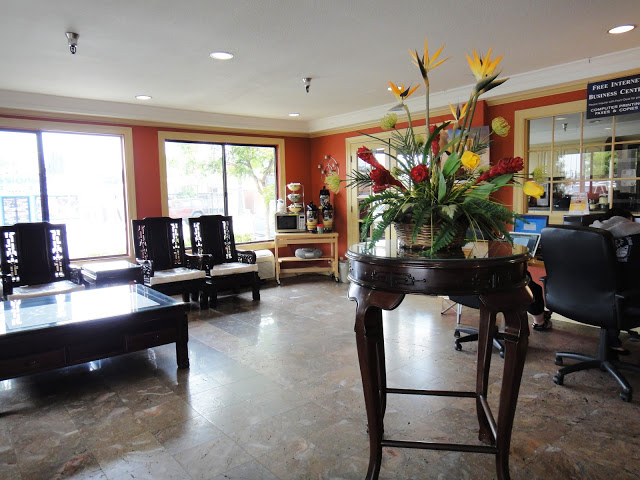
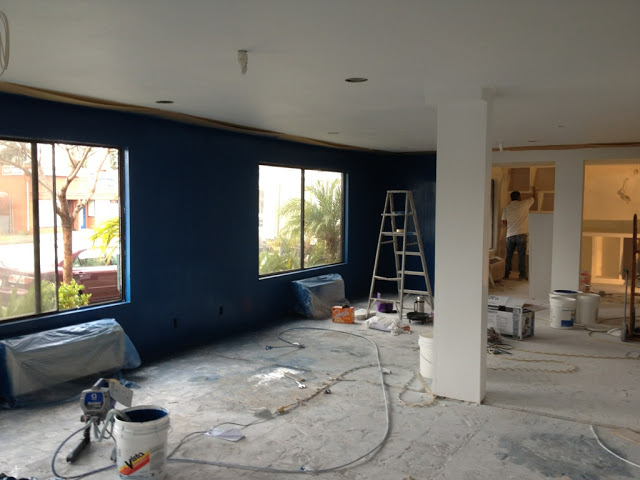
Before, the lobby was divided into 2 smaller spaces: one for seating and one for dining. I demolished this retaining wall to open the space up and make it one long galley. This allows for natural light to stream through the band of windows without disrupting the flow for guests.
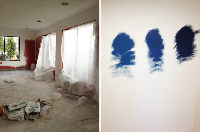
Samples First
It’s imperative to test small samples of color before committing to the whole shabang. Different colors react differently to the light filling the space so always, ALWAYS paint small patches before painting entire walls. I initially LOVED the last (3rd) blue on the swatch but when I saw it in the space I knew it would be too depressing and wayyyy too dark to deem “luxe.” Natural lighting makes ALL the difference.
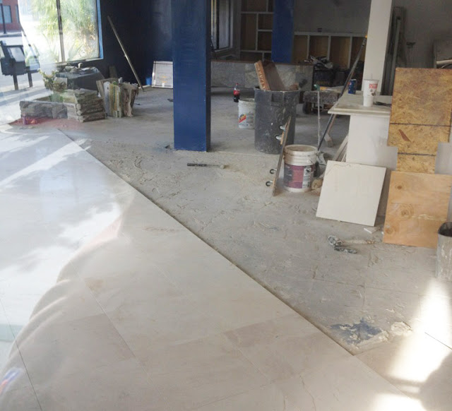
Doesn’t every haute hotel deserve some marble flooring??? I think so!
The Vibe
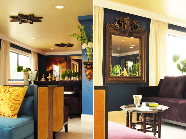
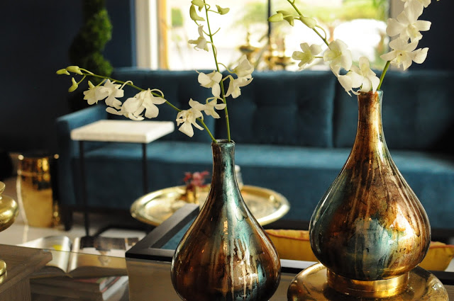
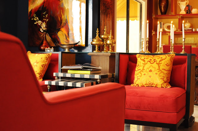
I wanted to break up our now lengthy lobby space into 3 distinct vignettes with a custom color story for each. One turquoise, one violet, and one rouge. The last thing any guest wants is to share space with other guests. It almost feels like your own private living room complete with rich accessories and global accents. Like you’re traveling afar to feel close to home. Ahhhh, can’t ya just imagine kicking back in these sumptuous custom club chairs?? Fit for a queen!
D I N I N G
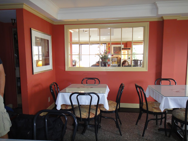
Before
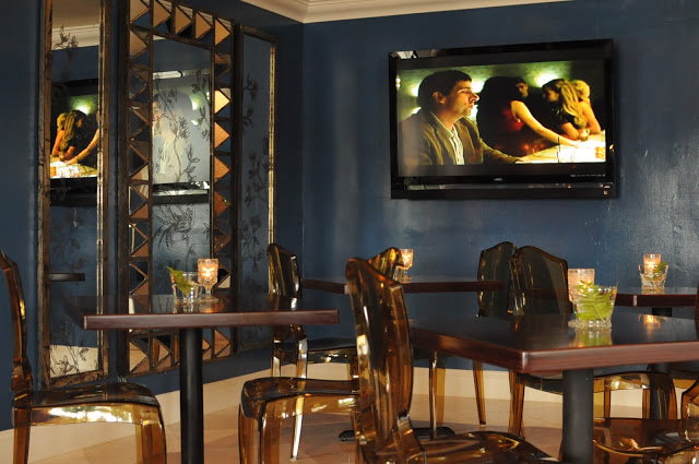
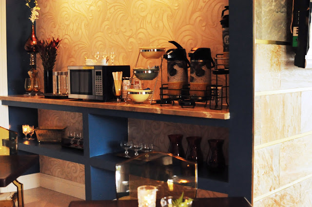
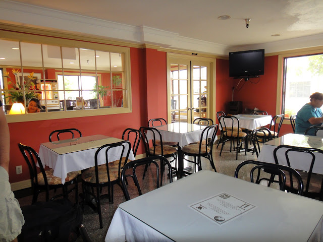
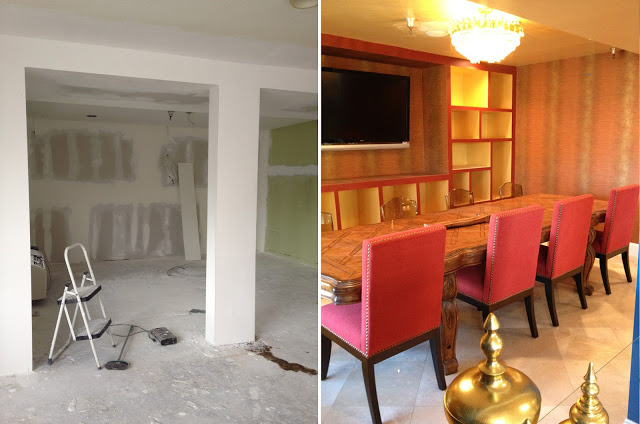
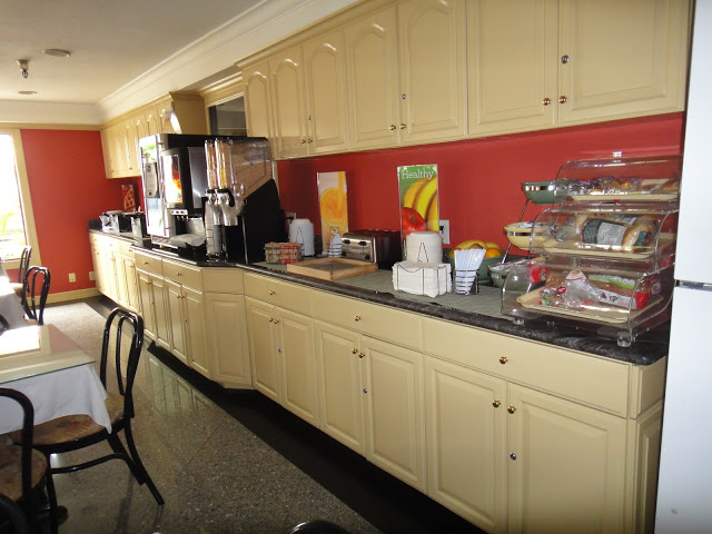
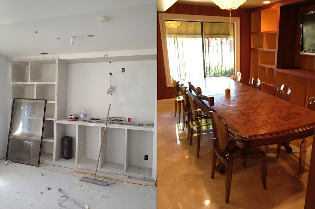
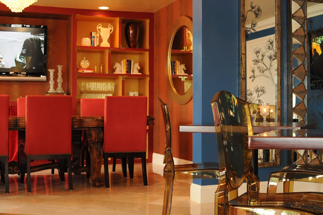
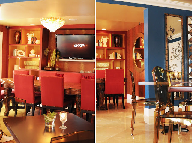
Before, the dining area was regulated to the rear of the lobby. Way too much space without much design intent made for lackluster visuals and a total waste of premium square footage. I divided this space up into 2 distinct areas, one for casual dining and one for more formal dining. Notice the usage of excessive mirrors. Cavernous spaces BEG for more light!
After
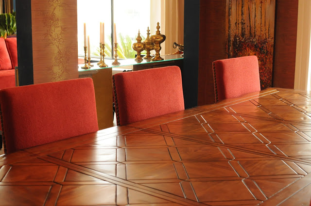
The formal dining space now doubles as a library where guests can either eat, read a book, or reserve the entire back lot for business meetings if guests are in town for a convention. Think “multi-purpose” when designing small spaces. You’ll never regret making major design statements when the space is used for a variety of functions.
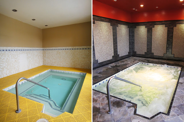
P O O L and S P A
Before
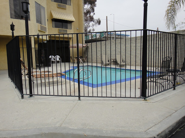
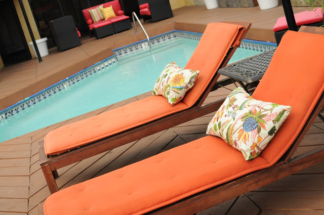
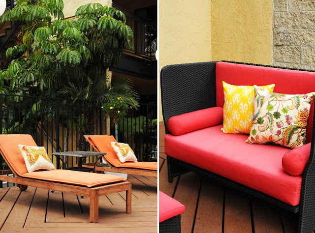
Before, the pool was all concrete and no design. Almost looks like a prison cell with those black bars! With the addition of some stained-wood plank decking, bright and bold outdoor furniture, and some strategic planting with lush greenery, we can now call this our very own urban tropical oasis. I’d KILL to be relaxing here right about now.
…or here. I’m not picky ;D
Thanks for joining me while I detail this lengthy process y’all! I find it much more informative if I break down the steps rather than showing y’all just a bunch of pretty “after” photos. Please let me know if you have any questions about the design. I’ll do my best to answer it all to help you infuse modern global glamour into your very own space!
Come back later this week as I source all the gorgeousness that’s been especially curated for this project! You won’t wanna miss the special edition of shop ’til you drop!!!




103 Comments
Great transformation!!!
This was such an interesting post to read! I never thought about all the challenges you would have designing somewhere like this, and it looks amazing now! Great job 🙂
katieneedsajob.blogspot.com/
Wow, you did a great job! I love especially the dining and the pool area! Also it's interesting to see the transformation!
What a beautiful transformation! Fabulous interior design! ヅ
P.S. You may want to check out blog & we'd love it more if we follow each other. ヅ
http://fashionmoto.blogspot.com
This seriously looks like a boutique hotel in miami or vegas or nyc. AMAZING JOB!!! The lobby alone would make me want to stay in a Quality Inn!
This looks awesome! It looks so chic!
Wow!!! That is quite the transformation, I can hardly believe it's the same place! Never would have thought it could be that glamorous. Thanks for stopping by and for your sweet comment 🙂
This looks amazing!!! Good for you, design is definitely your niche!!! Thanks so much for stopping by my blog btw. I've followed you on GFC and bloglovin, I would love it if you followed back xx
Marla
http://www.trendstruck.com
WOW WOW WOW.. You did such an amazing job! You took a boring hotel and transform it into a beautiful, stunning place that is very warm and inviting.
Love it, can't wait to see what you do next! Come check out my blog, maybe we can follow each other!
Material Fixations
I love the make over! It turned out great! Place was like you are in a king's place!
This is such a great make-over!
I especially like the lobby!
p.s. thanks for visiting my blog! Your blog is very inspiring, let me know if you would like to follow each other 🙂
Oh my goodness, I simply cannot get over the difference! You've done such an incredible job!
the-creationofbeauty.blogspot.com
My jaw just dropped. This is wonderful! I have a huge soft spot for hotels… Love what you did here 🙂
Thanks for the sweet comment on my blog! xx
Wow what a transformation! You are totally right about the reception being in a bad place to begin with.
Wow wow!
What a major transformation! The after is gorgeous!
oxo,
ML
TWENTY YORK STREET
Follow @20YS on Twitter : @20YS
Follow @20YS on Facebook: TWENTY YORK STREET
Recent post:http://www.twentyyork.com/2012/08/fall-fashion-jacob-chic-suitcase.html
Wow wow!
What a major transformation! The after is gorgeous!
oxo,
ML
TWENTY YORK STREET
Follow @20YS on Twitter : @20YS
Follow @20YS on Facebook: TWENTY YORK STREET
Recent post:http://www.twentyyork.com/2012/08/fall-fashion-jacob-chic-suitcase.html
Wow wow!
What a major transformation! The after is gorgeous!
oxo,
ML
TWENTY YORK STREET
Follow @20YS on Twitter : @20YS
Follow @20YS on Facebook: TWENTY YORK STREET
Recent post:http://www.twentyyork.com/2012/08/fall-fashion-jacob-chic-suitcase.html
Wow, what an amazing transformation! This is beautiful! I'm following now – would love it if you followed back 🙂
So amazing! Great job 🙂
go for the glam
I love the final results, looks amazing!
-Adriana
Little Petite
Wow! Amazing make over. Lots of details to manage. You did a wonderful job.. your color, style, and design are both beautiful and functional!
Thanks for stopping by today! Enjoy the start to a new week.
leslie
http://www.trouverlesoleil.blogspot.com
This amazing, totally love seeing before and after!
If you get a moment come check out my latest post!
XOXO
Morgan
http://thesocialboutique.blogspot.com
Love it! The space looks so much more modern & inviting! I'd like to stay there! Great job!
http://www.theShopaholic247.com
Thank you for stopping by my blog earlier.
What an amazing transformation! From a run-down place you transformed into luxury! I applaud you for your taste..
great blog! xx
http://www.azrakunworld.com
The whole place seriously looks like a dream!
Hi Julie!
Popped over via your comment on trouverlesoleil.
Your space planning solutions are very creative – giving this hotel lobby seating for sooo many! The seated reception is cozy and personal.
We have stayed in several Quality Inns during road trips and many are in need of updating. Maybe this client will lead to others for you!
Where is this project located? Stopping to see it in person would be fun. 🙂
Cheers!
Such a beautiful transformation!
Amy
Leopard and Lillies
THIS. IS. GENIUS.
I am amazed – the work done here is phenomenal! I am in love. This is like transforming a measly 1,5 stars unto 5 stars!
Edita
http://www.pret-a-reporter.co.uk
the transformation is amazing!! the place looks so much more luxurious after all the renovations!
bijou-minou.blogspot.com
That looks amazing…wow!! Love all the transformations…very chic!! Thanks so much for popping over to my blog, have a lovely week 🙂 x
Oh my gosh, you did such an amazing job! I know youve heard it a ton of times, but everything you did made it look so beautiful!
Thanks you so much!
I'm sure it will be a beautiful hotel
I hope you whenever you want 😉
Hi dear, wow, this is an incredible transformation, you are so creative and the great amount of effort and innovation you put into this project is clearly visible. The end results are amazing!
Wow what a transformation! You definitely took this place to a whole new level. Loving the eclectic colour palette, it kind of reminds me of old world Cuba! Truly stunning!
Have a lovely day!
SDMxx
http://www.daringcoco.com
The transformation is amazing! It looks so chic and sophisticated now! I'm SO impressed 🙂
-Sharon
The Tiny Heart
Enter my new giveaway open internationally!
DAMN MAMA…you really knocked that out of the park. Great work, like for real.
Oh wow you really did an outstanding job!!!!! You are truly talented =D
xoRosie
http://teacupsanddresses.blogspot.com/
Wow! Amazing transformation!
Oh wow, I really love the redesign! xx
Enter my giveaway for a chance to win a £150 gift card to Freddie & Cinnamon!
OMG now looks incredible!
http://cravingforbarneys.com
The final result is just amazing!!
Thank you for commenting over on my little old blog.
OK – I am blown away by this!! You didn't just do a make-over – you completely transformed the spaces!!
I want to go stay there!
you did great ! I am WOOOOW!
Looks so gorgeously swanky! Love it!
xoxo Bree
The Urban Umbrella
http://www.theurbanumbrella.com/
Still so hard to believe. The ghost chairs look amazing in the eating area, and I love the lacquered walls (I'm guessing it is lacquer and not high gloss?)… At any rate, amazing transformation!!! Whitley at the Queen City Style
Amazing!!
xoxo
That was a huge undertaking and quite the transformation!
love the new color scheme
brett
Wow that transformation is amazing! Thanks for your great comment and so glad to find your blog!
xo
Sharon
Wow–this is so gorgeous! You have an amazing sense of design. I love your aesthetic!
-Alyssa
The Glossy Life
OMG this is AMAZING!! What a wonderful and inspired job. I would love to stay there!
Thanks for visiting my blog! Yours is greaT1
Oh wow! Amazing change!! 🙂
WOW, that is an amazing transformation- you are an incredible interior designer!! Thanks a bunch for stopping by and commenting! I'm your new follower on GFC!
Love
Juneli from Fashionably Yours
Thank you Julie for the super nice message on my blog earlier! I can't believe what an amazing job you did with this! You are sooo talented and so inspiring!!! Wow! You truly have an eye for this and can't wait to see more from you! xx Pip
http://easyoutfitsbypip.blogspot.com
Oh. My. Goodness! Such a fabulous transformation. I mean, really, no words but WOW!
What a great transformation!
XX,
Miranda
oh my goodness , it doesn't even look like the same place! fab!
It's gorgeous! I love how glamorous it feels. What a great transformation!
http://www.kaescornerdesign.blogspot.com
Wowowowowo this is amazing!!!! Holy crap Julie!! What a transformation. Major props! You're totally gonna help decorate my first home one day, you talented thing you.
xxx
A great transformation! Looks so much better now.
LUXESSED
Lovely blog!! Would you like to follow each other on gfc and bloglovin?
Stephilà Creations-Myfashionblog
WOW! amazing.
thanks for your comment,i'm following you now:)
xo
http://the-caramel-dream.blogspot.com/
What a transformation! Great job you've done there!
That shade of blue is gorgeous, so majestic!
Gorgeous! The transformation you did on this hotel is amazing! I love the bold use of blue contrasted with the red at the built in area perfect spot for cocktails with friends!
I really love the informal dining with the smoky chairs and the blue AND your selections of mirrors!
You did an amazing project, I know look at the Quality Inn in a whole new way!
Love how you treated the check in area, very personal!
Xx
Callie
Looks awesome! What an amazing transformation!
xoxo, Emily
http://www.mainstreetchic.blogspot.com
WOW! Great transformation, Julie! I love it!
this is incred, love the photos
Great post, thanks for sharing!
if you like we can follow each other on bloglovin 🙂
let me know!
STYLE DECORUM
It looks AMAZING! I love the colors and all the decor. What a fabulous transformation!
xo, Yi-chia
Always Maylee
Wow wow wow!!! Such a transformation! I can't decide which is my favorite element. But I'm loving the deep dark walls and gold mirrors!
xx. Patience
whitelacquer.blogspot.com
That is quite a change. You completely transformed the place. Job well done!
Julie,
WOW… what an amazing transformation. Congrats!
Julie,
WOW… what an amazing transformation. Congrats!
Hi dear!
WOW, I love your blog! Amazing pics!!!
I'm now your newest follower!
Follow each other?
X♥X♥
Vanessa
http://lifelikevision.blogspot.com/
I actually cant believe the transformation – it looks incredible! I love the glamorous look now – it just looks so much better, and all the styling and trinkets look beautiful and really pull the space together.
Love the pool area too – so stylish!
Rachie xo
Wow! What a transformation! I'm absolutely amazed! Following you now 🙂
http://fashionroll.net
whoa!!! you have some serious talent. the new space is beautiful!!!
what an exciting project! thanks for sharing 🙂
xo SideSmile,
Ashley
SideSmile Style Blog
wow love your photos!
the design looks soo great… you did a very good job!
thanks for your comment!
xoxo milla
Oh my God, Julie, it's stunning ! You are very talented; bravo !xx
u did a GREAT job!!!!
love to have u stop by my blog and get ur advice
I'm loving this new look. With most hotels, even if they're nice, I'm used to seeing neutral and beige tones. I really love the pops of colour and the details in this transformation. Looks awesome!
Sincerely,
Sabrina
what a great job! well done!
Graet Post. I follow your Blog now.
Please follow me.
A.
dramaticmode.blogspot.it
Wow! Seriously…amazing. It looks like night and day – such a wonderful transition! So much higher luxery! 🙂
The before and afters are CRAZY! I love this!!
Wow, your blog is so interesting and that post is very inspiring. That transformation is totally crazy, it looks like a different place now. And I really like it. Great work!
-Doris
I love this transformation! The navy color on the walls is so pretty and the plush furnishings are so inviting!
Such an amazing transformation !!!
xoxo
Christy
http://www.am2pmchic.com/
Hello dear, I think this is the first blog about design that I find…How great it is!
I'm your newest follower now, and I hope you will follow me back, it would be great to keep in touch!
XOXO
Ylenia
nice post!
Love,
http://www.chicksinfeathers.co.cc
WOW. looks like a completely different venue. amazing transformation xx
Julie!
thanks for stopping by my BLOG!
LOVE the blue walls. They remind me of the bedroom in Cruel Intentions! ….L-O-V-E!
xo.
http://dropsofjupiterBLOG.com
that's so great x
Love the transformation! 🙂
how great! i especially love the outdoor pool area – that's my favorite!
thanks for your nice comment. i hope you like other looks in the blog and want to follow me
fran
showroomdegarde.blogspot.com
The transformation is jaw dropping. What a difference! Amazing!
http://foodfashionandflow.blogspot.com
WOW it looks SUPER pretty!
Travel in Style
Wow, you've done such a gorgeous job!
Carmen Ri.
So beautiful. You look precious in this look!
MY CHIC
what a transformation! You did an amazing job. Looks so glamorous and inviting now…true hotel style
Millie from passiondecor
thanks for information 😀