I’m so excited to finally share more progress shots from Casa Hacienda! You know that 5300sf custom home that I’ve been designing for yearsssss in Hacienda Heights, previously seen HERE and all over my Instagram.
The Client
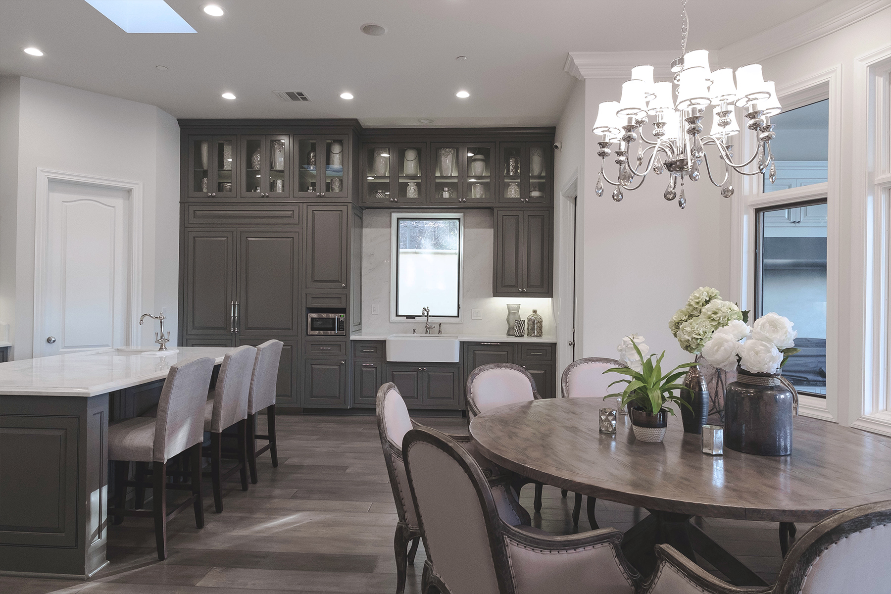
The home was custom built as a single family residence. When we started the project, it was just the client and his spouse. Fast forward 2 years later and now they have twins. So of course, this home was meant to grow alongside them so I made sure to specify the right materials for their constant change of lifestyle.
The Concept
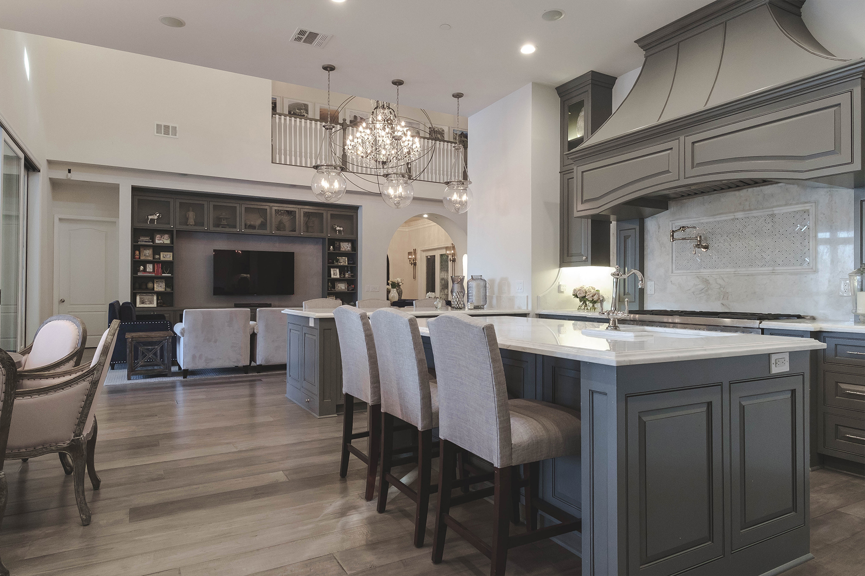
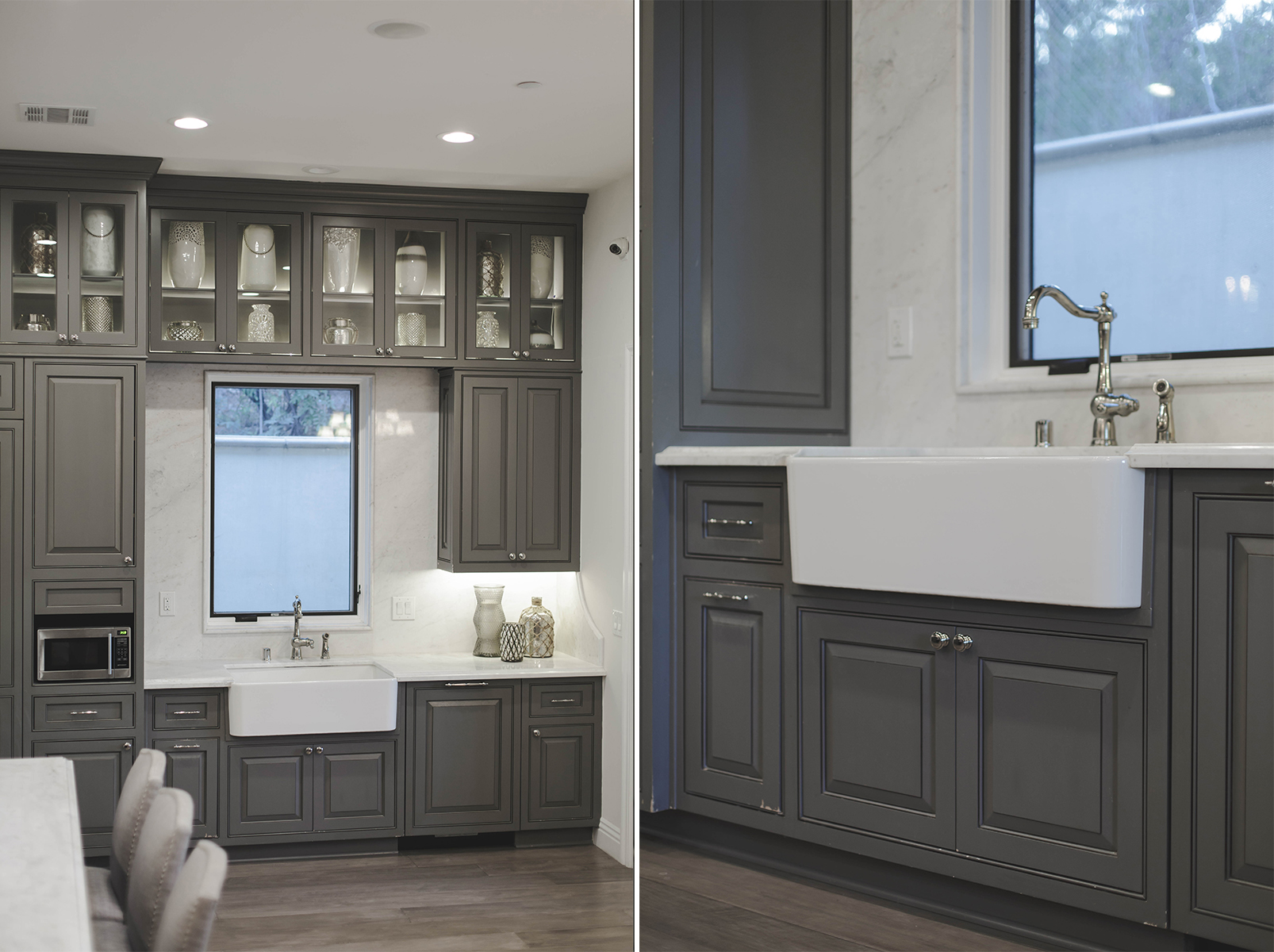
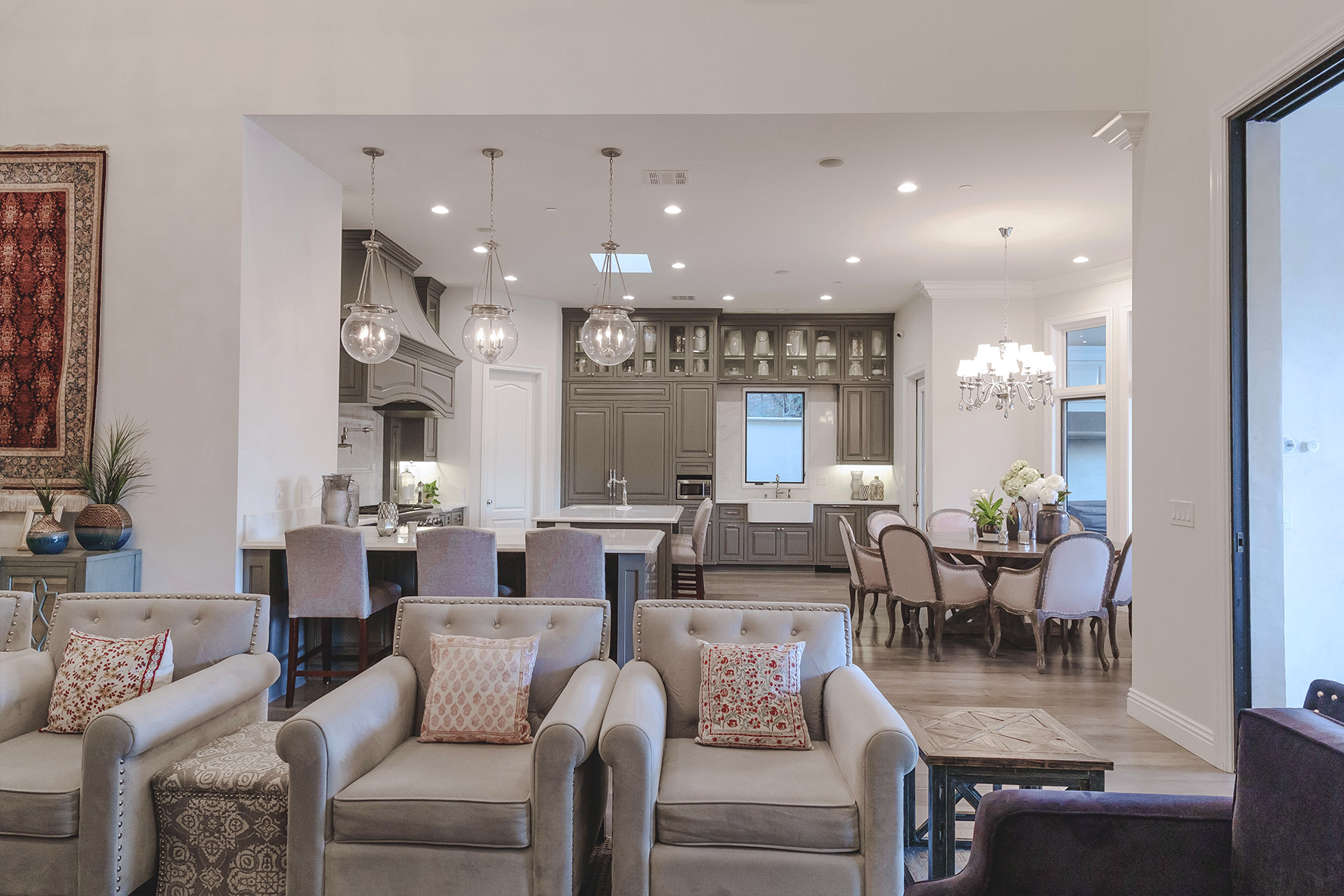
Like most clients, they wanted a completely neutral space. I don’t know what it is, but people are afraid of color! Even with a professional at the helm, I think there’s a stigma living around so much of the same color you’ll eventually get sick of it. But you know me, I LIVE for color and pattern so designing this kitchen around greys and taupes was a challenge in itself!
Materials and Finishes
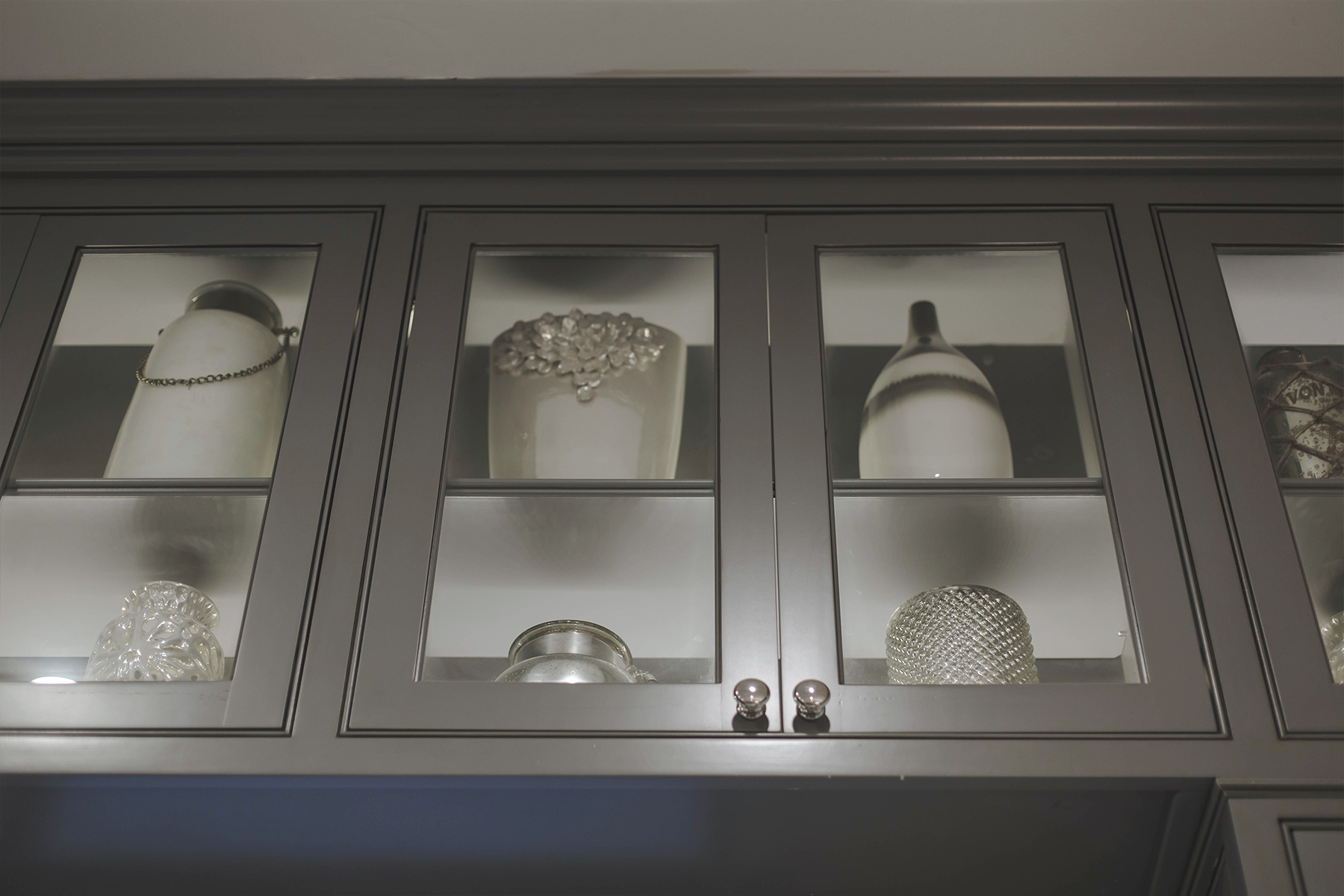
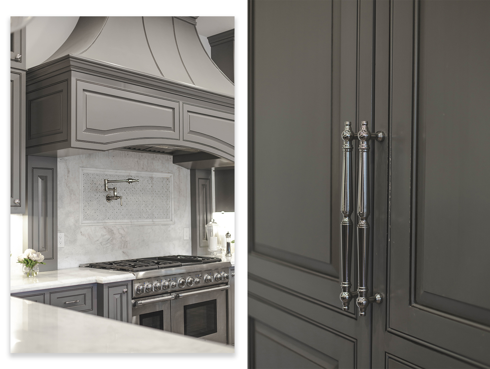
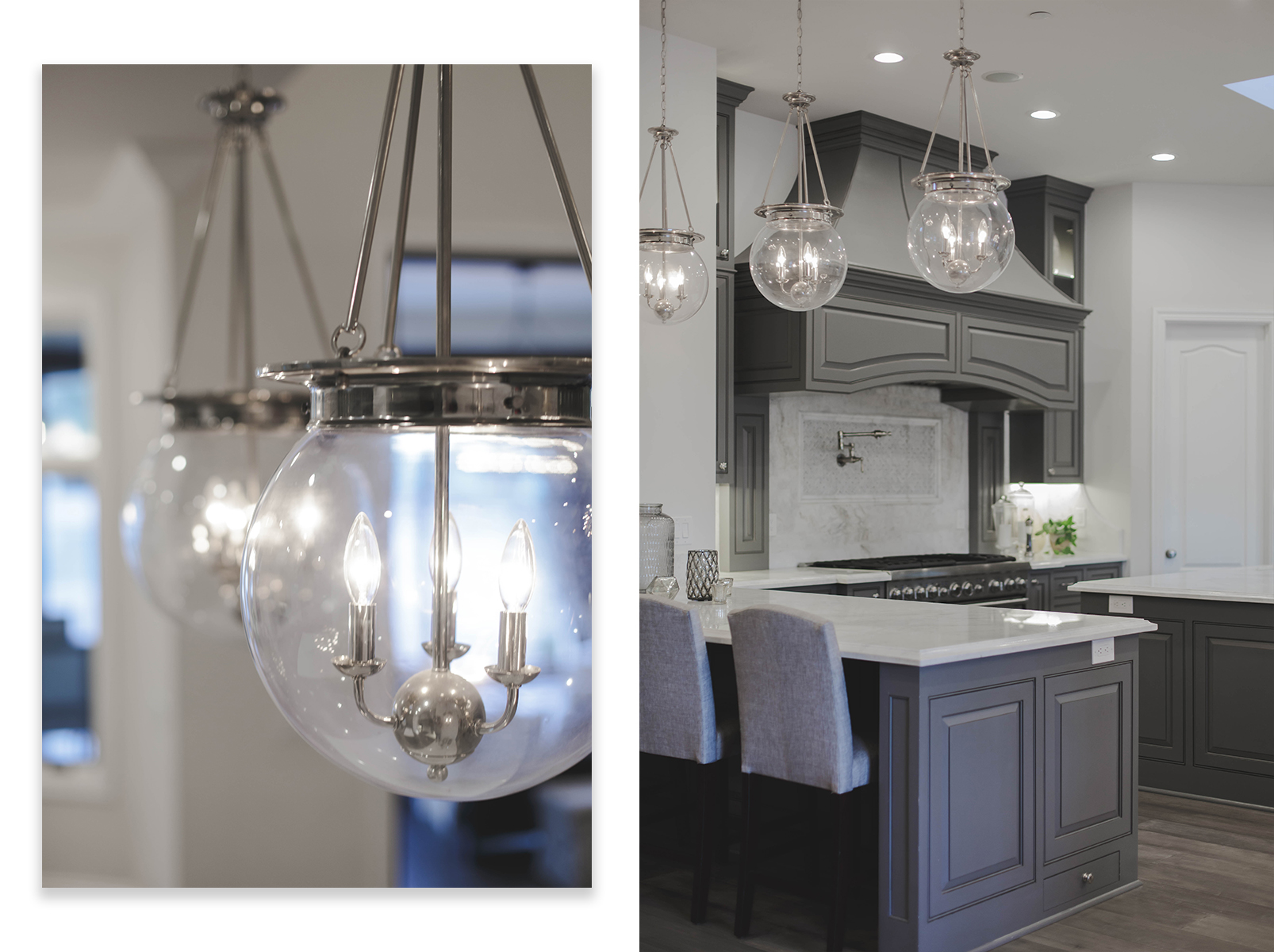
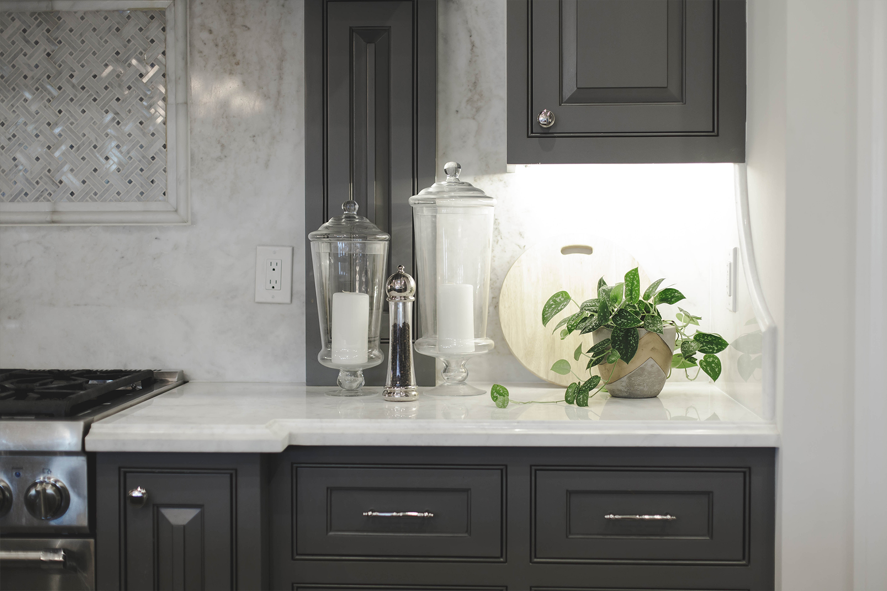
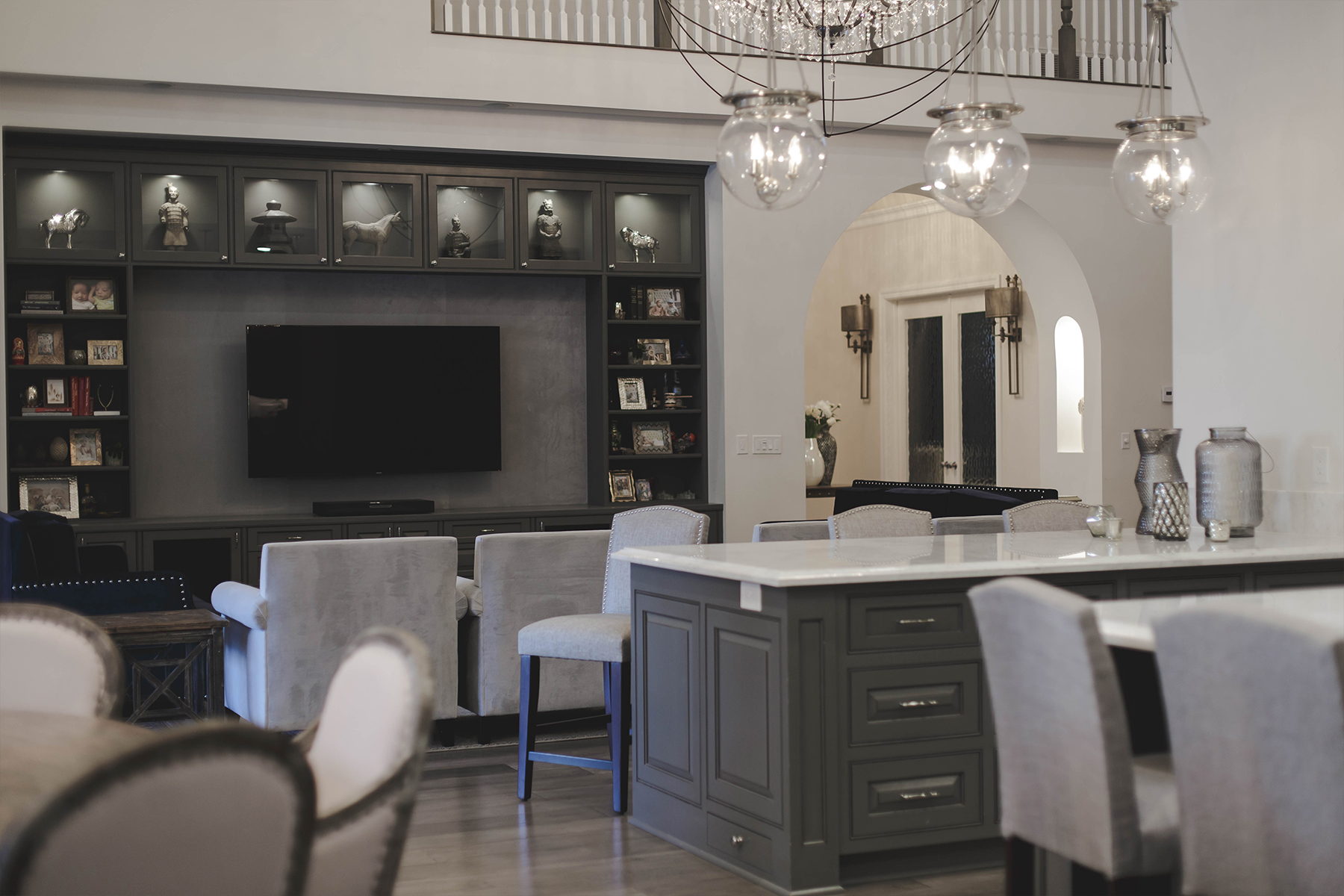
Anytime you have a neutral palette, you BETTER bring it with the most fanciful finishes you can find. I absolutely fell in LOVE with this Arabescato white marble slab and ended up pulling the custom grey cabinet color right from its veins. The problem with marble is that it never quite photographs as beautifully as you experience it in real life. But you can bet the kitchen GLEAMS with this high contrast of dark French grey over white.
So luxe yet still so livable.
Furniture and Accessories
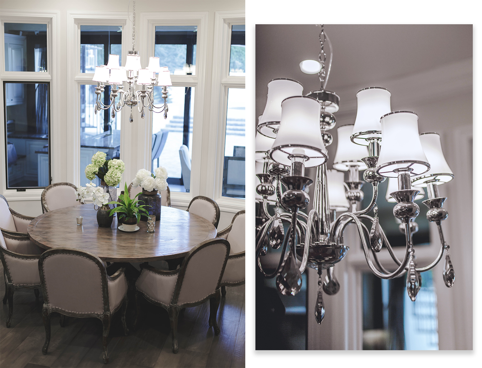
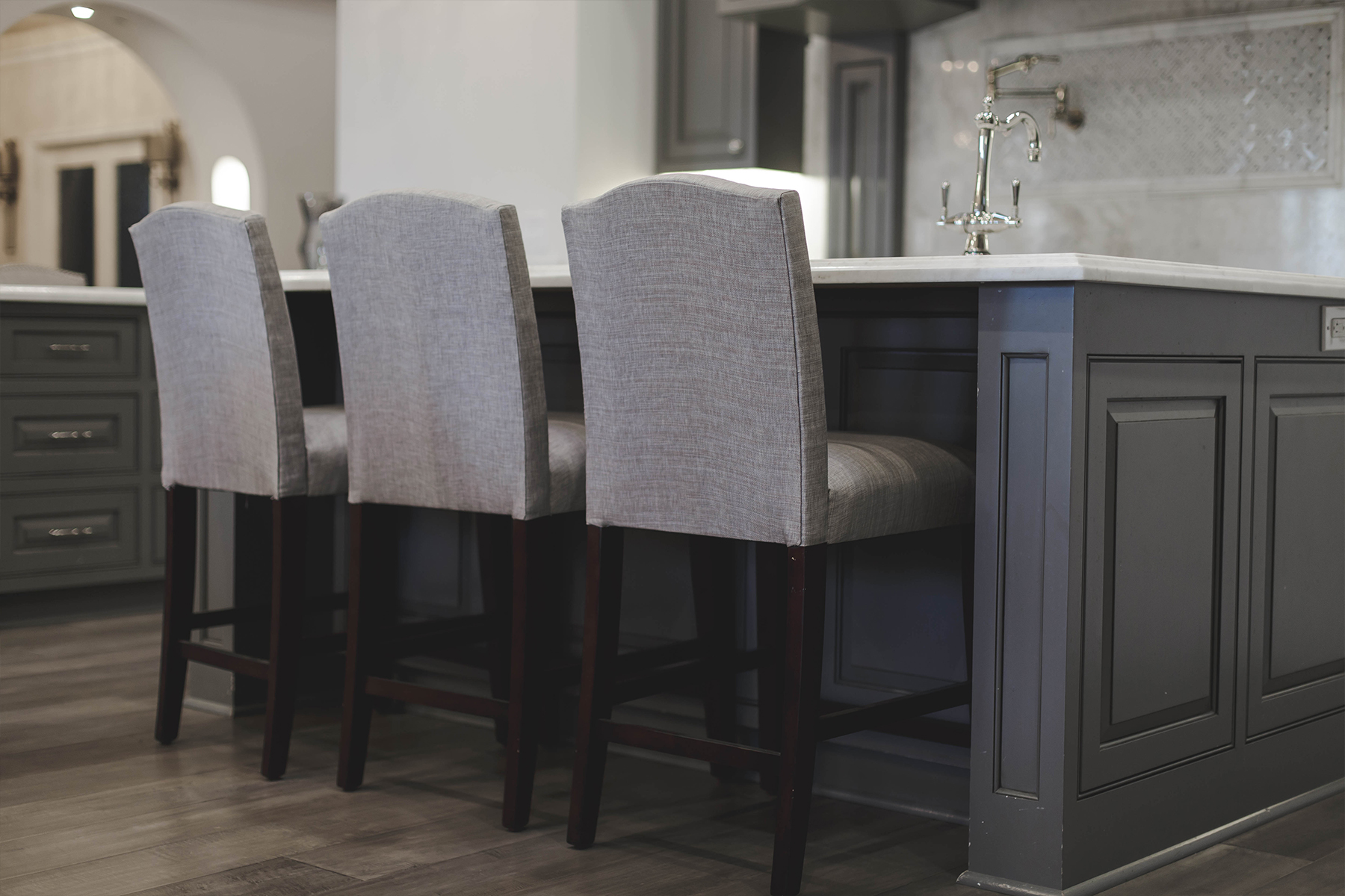
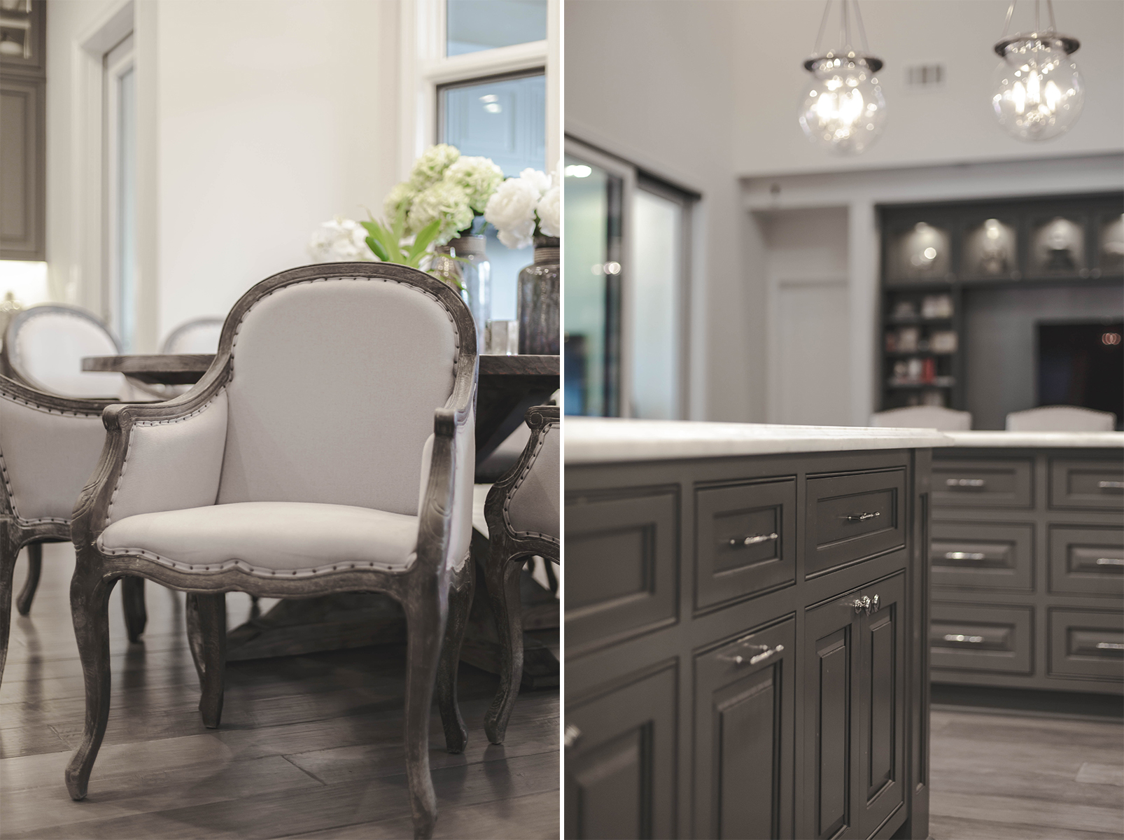
I kept the palette soft and neutral relying on beautiful natural finishes of distressed wood, raw linen, and glazed porcelain to accompany the lack of color. The dining chairs and table were an incredible score from Overstock. Where we splurged on custom cabinetry, we saved on furniture because you can find great pieces at every price point but you can’t substitute custom!
SHOP THE POST
Dining chairs | Dining table | Counter stools | Pendant Lights | Flooring
Designer’s Tip:
Splurge on one-of-a-kind items. Skimp on EVERYTHING else.
Closing thoughts
I always advise my clients to pick a few key components from the overall space to really focus the budget on. For the kitchen, it was the cabinets. I purchased most of the furniture you see here at various retailers (linked above) and a majority of the accessories from Homegoods.
You don’t need a TON of money to finish a space, just a little creativity and a whole lotta elbow grease!
What do you think of my latest residential design? Have you peeped looks from #JKIDCasaHacienda on Instagram?



6 Comments
Gorgeous!! Great job on the whole project!
Thanks so much Heather! Have a fabulous weekend babe! xx
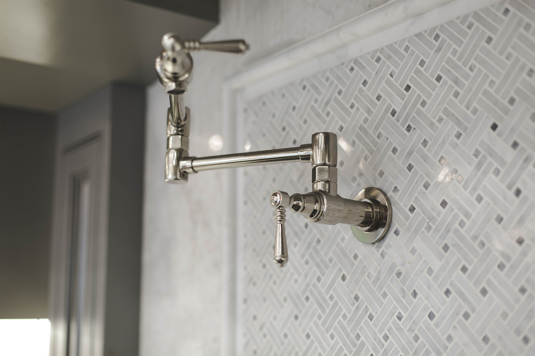
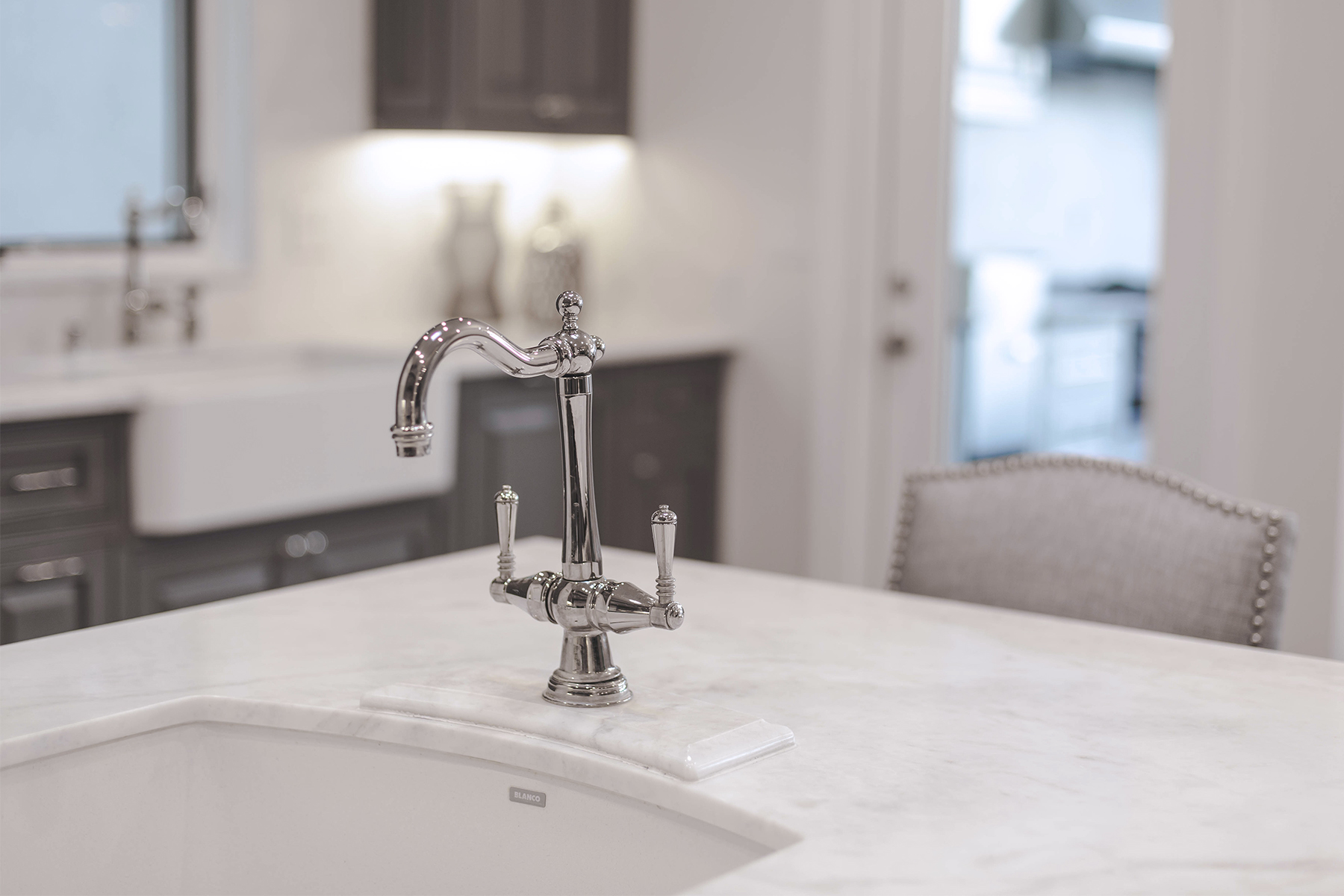
Love the kitchen faucet and pot filler. What brand is it?
Thank you for visiting Lauren! It’s all from Brizo
Hi Julie,
Im trying to find those kitchen pendants you used the link just sends me to wayfair homepage not to those pendants, do you have item specifics so I can find them for purchase?
Hi Ava, sorry about that! Wayfair tends to do that when the products are sold out.
If you want to try and track it down, it’s the Karina Pendant in Polished Nickel (7-3301-3-109). Hope that helps!